Lightning App Builder Components: Standard vs AppExchange (2026)
What Lightning App Builder components are, every main standard component and its documented limits, what the builder costs, and when an AppExchange add-on makes sense.
The short answer: Lightning App Builder components are the drag-and-drop building blocks of a Lightning page. Salesforce describes a component as "a compact, configurable, and reusable element" that you add to a page in the Lightning App Builder. Lightning pages support three kinds of components: standard components built by Salesforce, custom components that you or someone else built (usually Lightning Web Components), and third-party components from the AppExchange, which Trailhead now calls AgentExchange. The builder itself is included in Group, Essentials, Professional, Enterprise, Performance, Unlimited, and Developer Editions, so there's nothing extra to buy for it.
That's the definition. The useful part is knowing what each standard component can do, where it stops, and when it's worth adding something from outside the box. That's what this guide covers.
What Is Lightning App Builder, and How Does It Work?
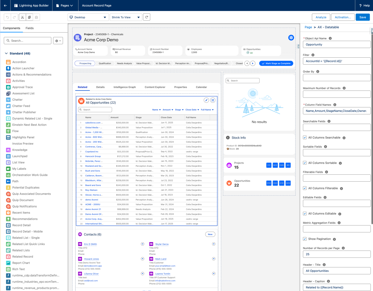
Lightning App Builder is Salesforce's point-and-click tool for building custom pages for Lightning Experience and the Salesforce mobile app. You open it from Setup (search "Lightning App Builder" in Quick Find) or from Edit Page on any record, app, or Home page.
The model is simple:
A page is made of regions. The template you choose when you create the page splits it into regions and controls how it adapts to desktop and phone.
Regions hold components. You drag components from the palette on the left onto the canvas. A single region can hold up to 100 components.
Each component has properties. Select a component and the properties pane on the right shows its settings: which object, which list view, which report, how many rows.
You save, then activate. A page does nothing until you activate it, for example as the org default or for specific apps and profiles.
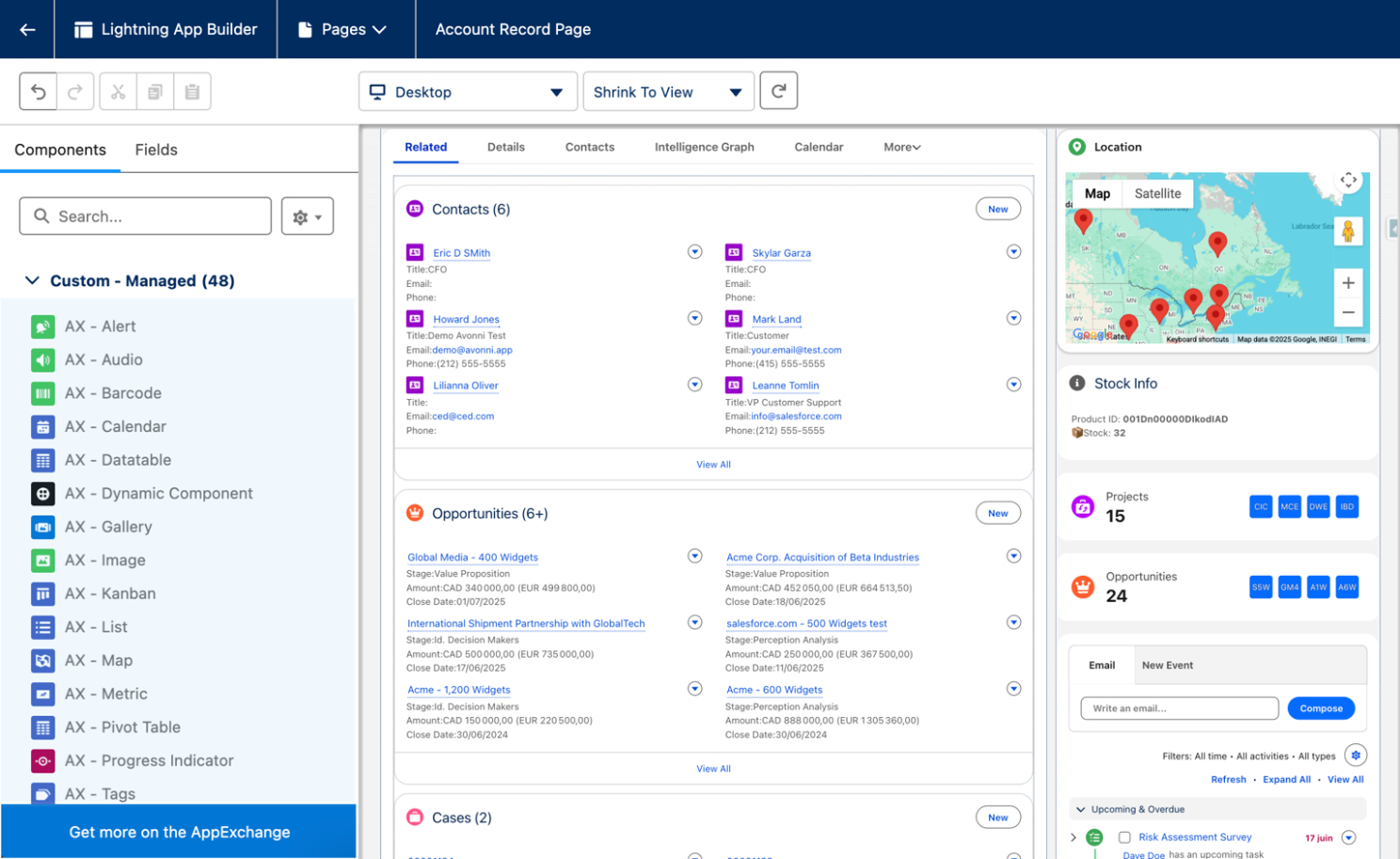
Lightning App Builder on an Account record page: the palette on the left, the canvas in the middle, the selected component's properties on the right.
You can build several page types. The three you'll use most are record pages (a custom version of an object's record page, on desktop and mobile), app pages (a home page for an app, on desktop and mobile), and Home pages (Lightning Experience only, assignable by app or by app and profile). There are also email application panes, forecasts pages, and a few more specialized types. Once you set a page's type, you can't change it.
The same tool also manages Lightning apps. When you edit an app from the App Manager, you land in Lightning App Builder to change its branding, navigation, and utility bar.
What Types of Components Are Available in Lightning App Builder?
This is a common certification question, and the answer comes straight from Trailhead. Lightning pages support three component types:
Standard components. Built and maintained by Salesforce. They show up in the palette under Standard, and which ones you see depends on the page type and object.
Custom components. Lightning Web Components (or older Aura components) that a developer has configured for Lightning App Builder. For a Lightning Web Component, that means settingisExposed to true in its js-meta.xml file and listing the page types it supports, such as lightning__RecordPage, lightning__AppPage, and lightning__HomePage.
Third-party components. Packages from the AppExchange that install components already configured for Lightning App Builder. After install, they appear in the palette next to your custom components.
On record pages there's also a Fields tab in the palette. That's Dynamic Forms: you place individual fields and field sections directly on the page instead of relying on the page layout.
The Main Standard Components and Their Limits
Salesforce ships dozens of standard components, and many only appear for specific clouds or licenses (Service Cloud Voice, Rebate Management, Forecasts, CRM Analytics). Here are the general-purpose ones most admins use, with the limits Salesforce documents for each.
Component
What it does
Limits worth knowing
Record Detail
Shows fields and sections from the page layout
You can't add, remove, or move fields in the builder; edit the page layout instead, or switch to Dynamic Forms
Highlights Panel
Key fields from the compact layout plus page actions
Shows up to the first 7 fields on desktop and 10 on mobile
Dynamic Highlights Panel
Highlights configured directly in the builder
Up to 12 key fields; supported on LWC-enabled objects
Related List – Single
One related list on a record page
Basic list shows the first 4 fields; Enhanced list shows up to 10; record pages only
Dynamic Related List – Single
A related list you configure in the builder: fields, sort, filters, actions
List and Tile types only; custom actions not supported; results truncated at 2,000 records
Related List Quick Links
Hover links that preview each related list
Hover shows the first 10 items; Open Activities and Activity History aren't supported
List View
The first records from a list view
3 records by default, 30 max; doesn't support Activity, Files, Recently Viewed, or User list views
Recent Items
Recently used records
3 by default, 30 max
Report Chart
A chart from a report
Refreshes when data is more than a day old; filtering by record only works on record pages; no reports from My Personal Custom Reports
Dashboard
An embedded dashboard
App pages and Home pages only; record pages don't support embedded dashboards
Flow
Runs a screen flow on the page
On record pages, "Pass record ID into this variable" sends the current record's ID to a Text input variable
Tabs
Groups components into tabs
Up to 100 tabs; record and Home pages only
Accordion
Collapsible sections of components
Up to 25 sections, 10 or fewer recommended; record and Home pages
Rich Text
Formatted text and simple HTML
4,000 characters max; no JavaScript, CSS, or iframes
Visualforce Page
Embeds a Visualforce page
Page must allow Salesforce mobile apps and Lightning pages; height defaults to 300 px on mobile if left blank
Chatter, Chatter Feed, Chatter Publisher
Feed and publisher on a page
Chatter is turned off by default in new orgs starting Summer '26
Showing a component only when it makes sense
Every one of these components, plus custom and AppExchange components, supports visibility rules. In the properties pane you add filter conditions, and the component stays hidden until they're met. On record pages you can filter on the record's own fields (ID fields included) or on advanced fields from related objects and the User object, up to five relationship spans. App and Home pages have no record, so filters there use the User, User Permission, or Device context. A Device filter is how you show a component only on phone or only on desktop.
One gotcha from Salesforce's docs: if your rules hide every component in a region, the region shows up empty.
What about the dashboard on a record page?
This comes up a lot. The standard Dashboard component only works on app pages and Home pages: record pages don't support embedded dashboards. On a record page, use Report Chart with a filter so the chart shows data for the current record. If you have CRM Analytics, its dashboard components can also go on record pages.
Where the Standard Components Fall Short
The standard set is solid for what it's meant to do: show a record, its related lists, and some reporting around it. The gaps show up when users want to work with data on the page rather than just read it:
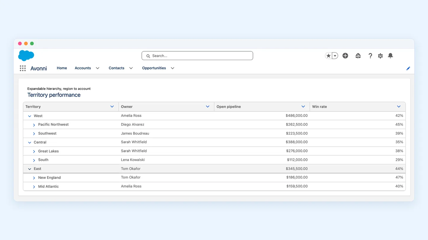
Related lists are lists. Dynamic Related List – Single added filters and sorting, which helps a lot. But it's still a list or tiles. No kanban board grouped by stage, no calendar of related events, no map of related accounts.
Charts live in reports. Report Chart shows one chart from one existing report. If the report doesn't exist, someone builds it first.
Dashboards stop at the record page. As above, the standard Dashboard component isn't supported there.
Rich Text is static. Simple HTML only: no JavaScript, CSS, or iframes.
Components don't share much. Apart from specific pairs, like Chatter Publisher with Chatter Feed, standard components don't react to each other on the page.
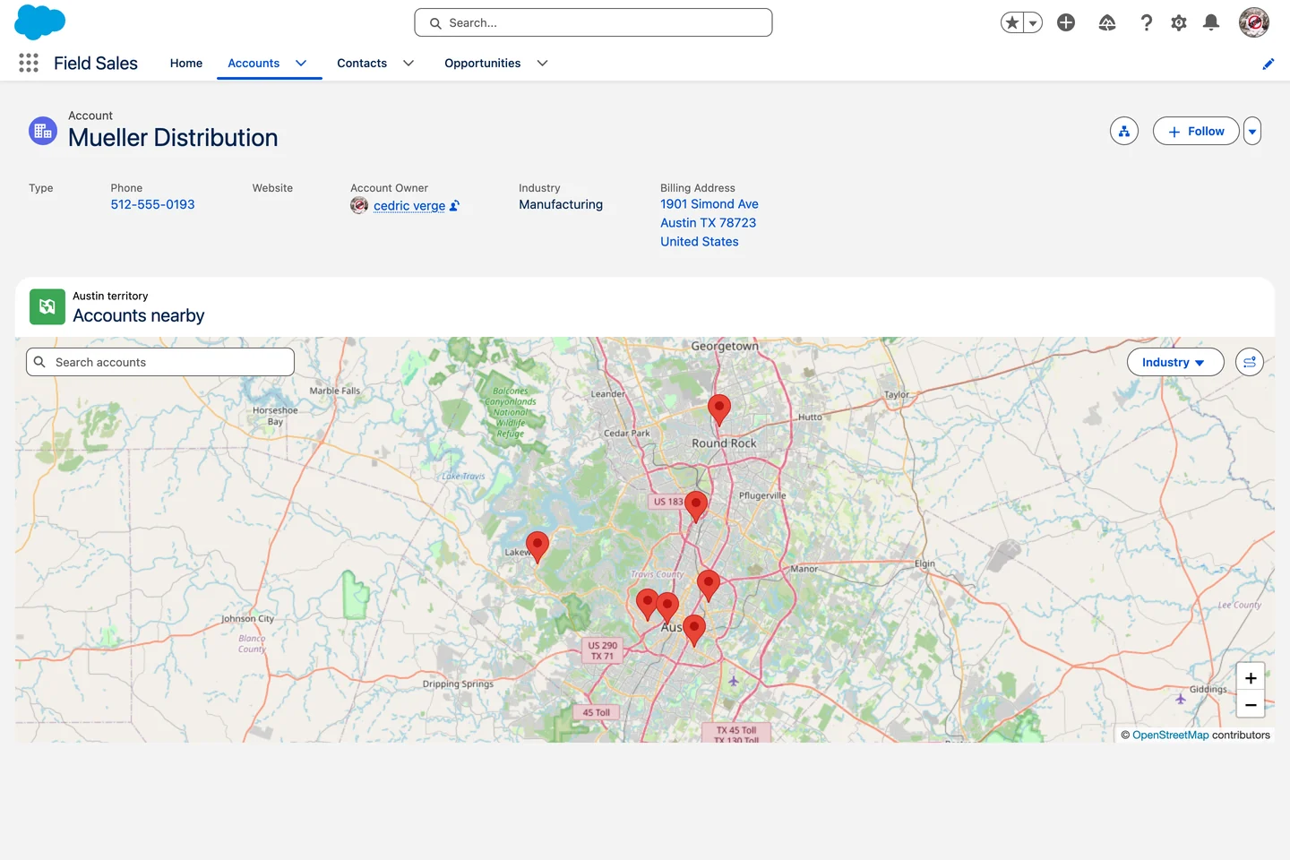
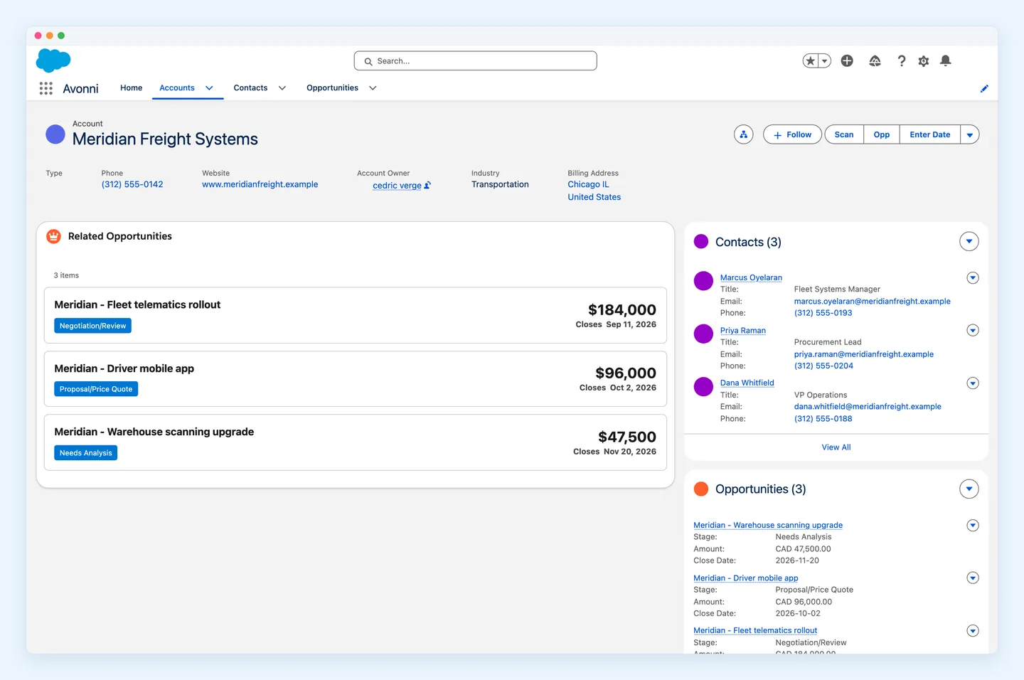
A map of nearby accounts on an Account record page, built with an AppExchange component (Avonni Map). A related list can't show this.
If you hit one of these, you have three options: accept the limit, build a custom Lightning Web Component, or install an AppExchange component.
When to Use AppExchange Components
Use the standard components first. They're supported by Salesforce, free, and updated every release. Reach for an AppExchange add-on when:
The need is visual and recurring. Kanban boards, calendars, maps, timelines, and pivot tables come up on many objects. Building and maintaining each one as a custom LWC adds up fast.
Admins, not developers, own the page. A packaged component is configured in the same properties pane as a standard one. Nobody has to touch js-meta.xml.
You need it on several page types. A good package targets record, app, and Home pages from day one.
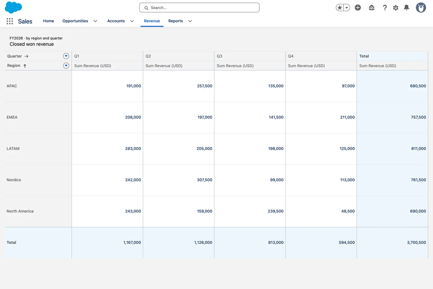
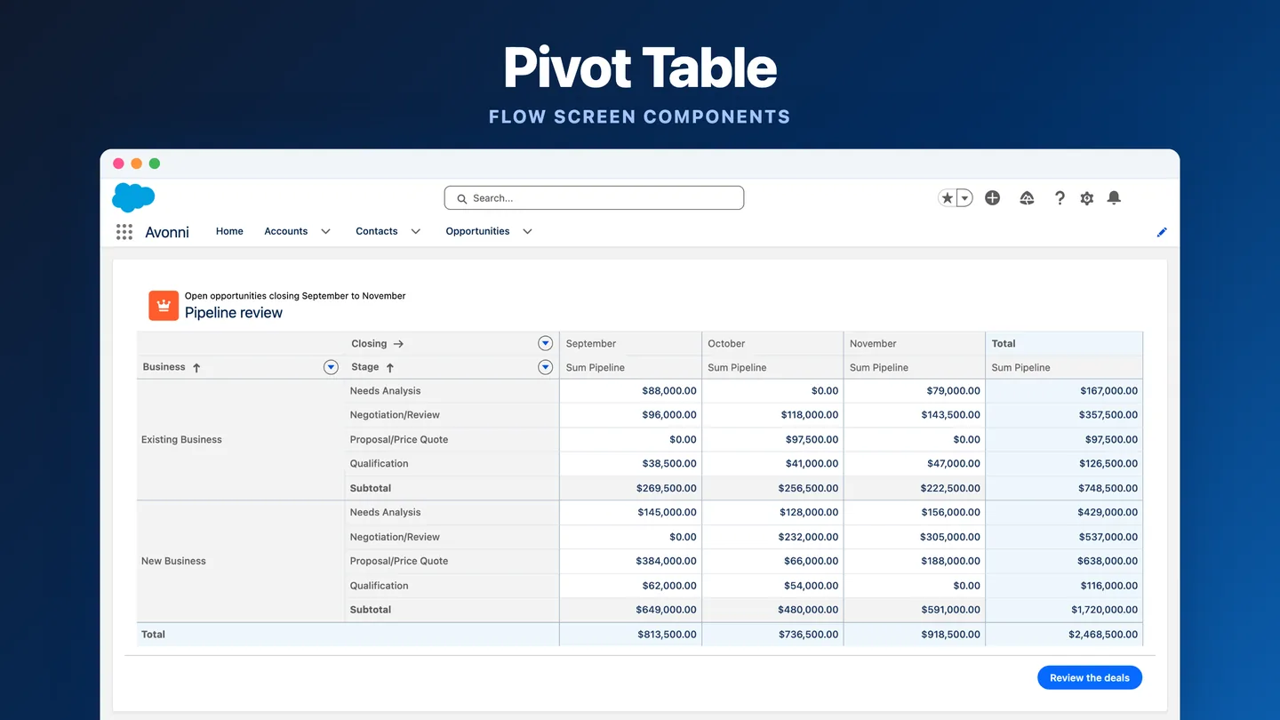
A pivot table on a Lightning page: closed won revenue by region and quarter, with totals, and no report to build first.
Build a custom LWC instead when the logic is unique to your business, when you need full control of the code, or when the component is a one-off.
Before installing anything, check three things on the listing: that it passed Salesforce's AppExchange security review, which editions it supports, and how it's licensed, meaning per user, per org, or free. Then install it in a sandbox first.
How Avonni's App Builder Components Fit
Full disclosure: this is Avonni's blog, and Avonni makes one of these packages. Here's what it does and doesn't do, so you can judge for yourself.
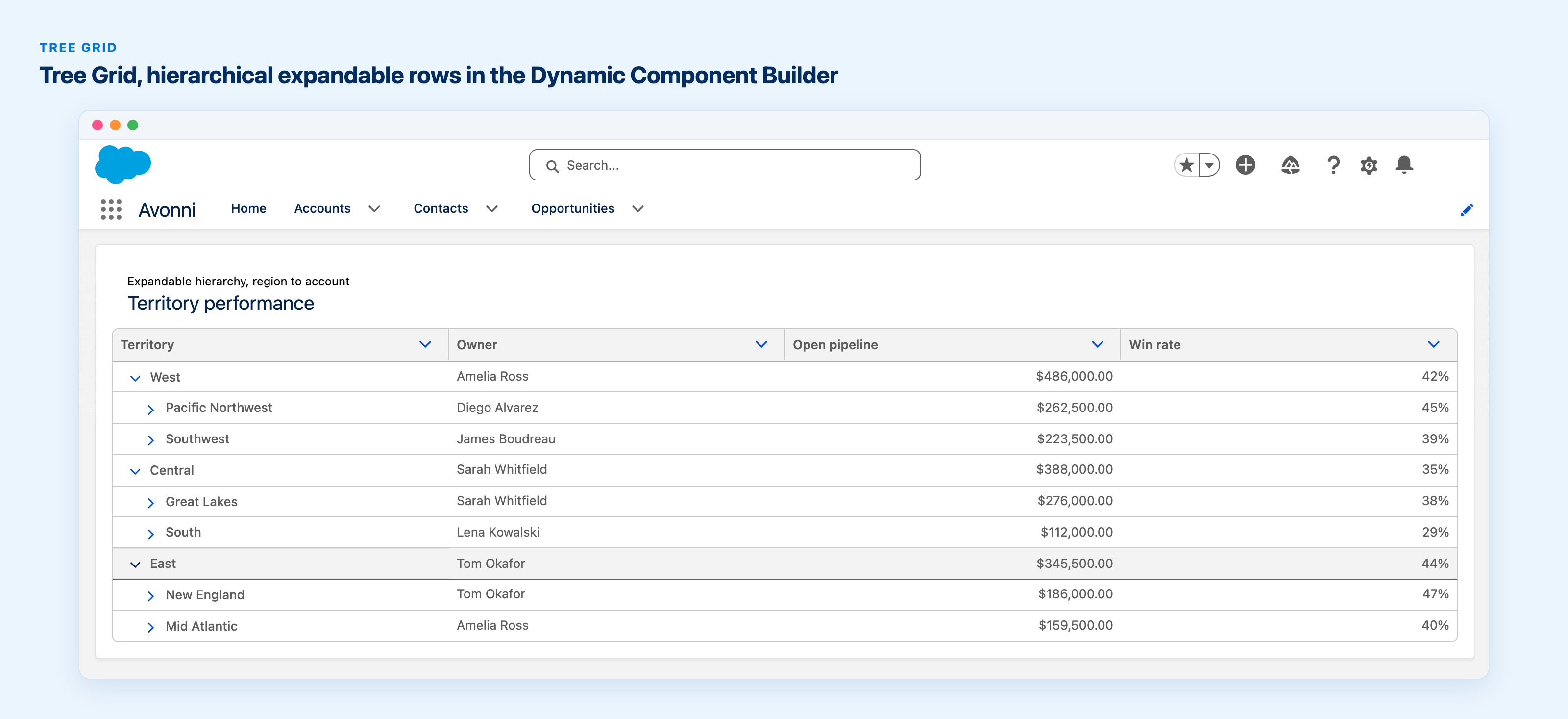
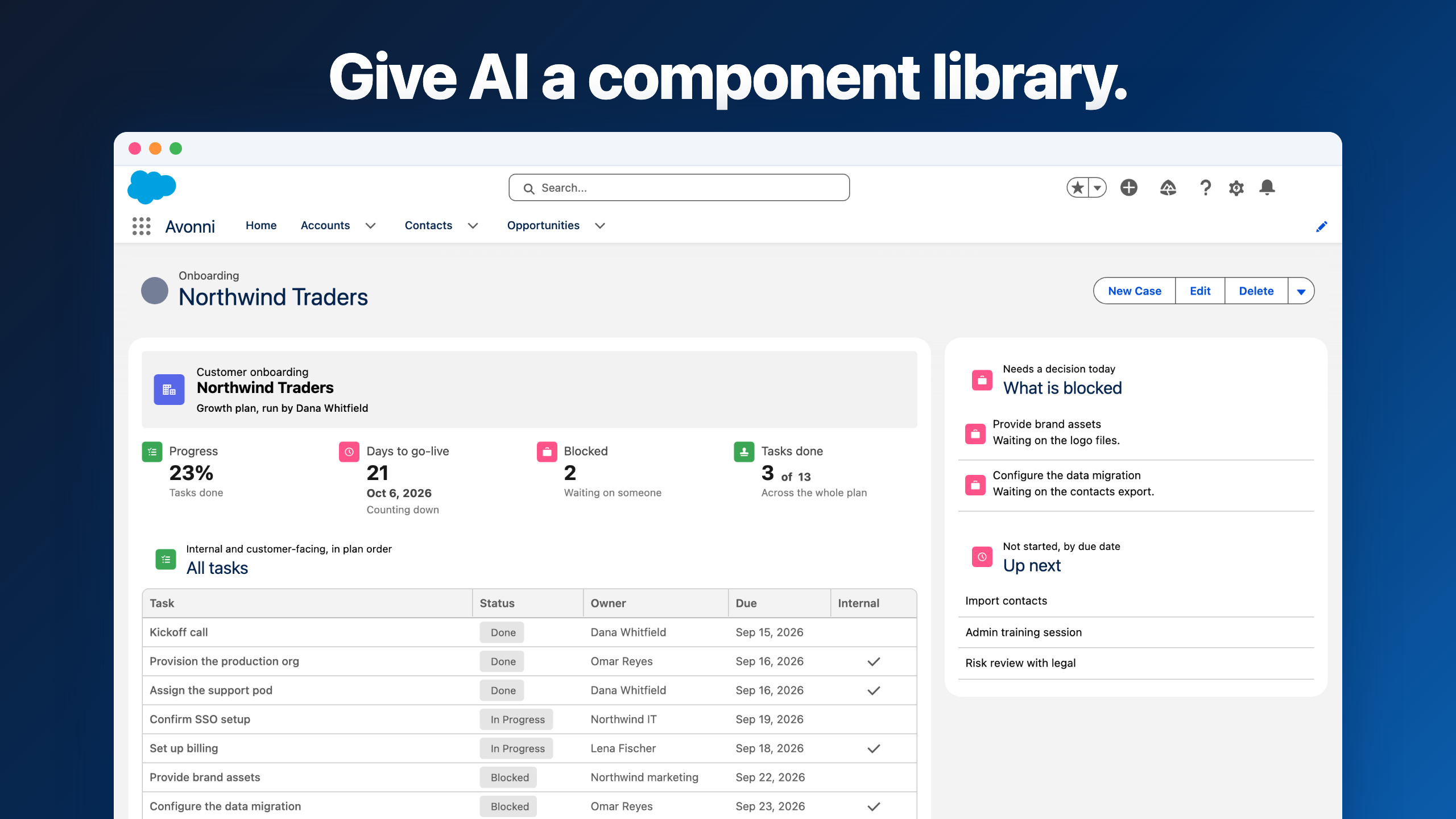
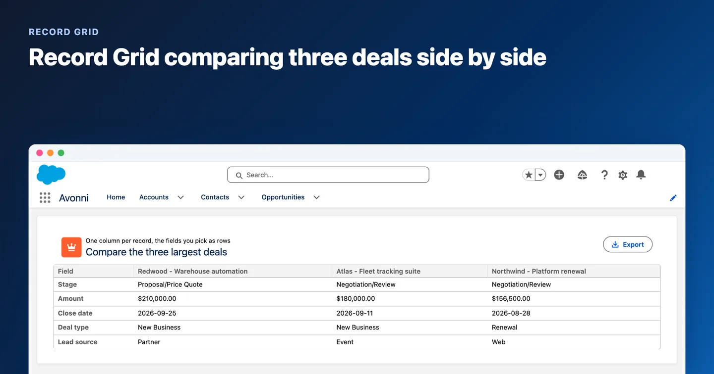
Avonni App Builder Components adds 17 components that drop onto record, app, and Home pages: Data Table, Kanban, Calendar, Map, List, Timeline, Pivot Table, Metric, Gallery, Image, Video, Audio, Barcode, Alert, Progress Indicator, Tags, and Dynamic Component. That last one embeds a layout built with Avonni Dynamic Components.
They map to the gaps above:
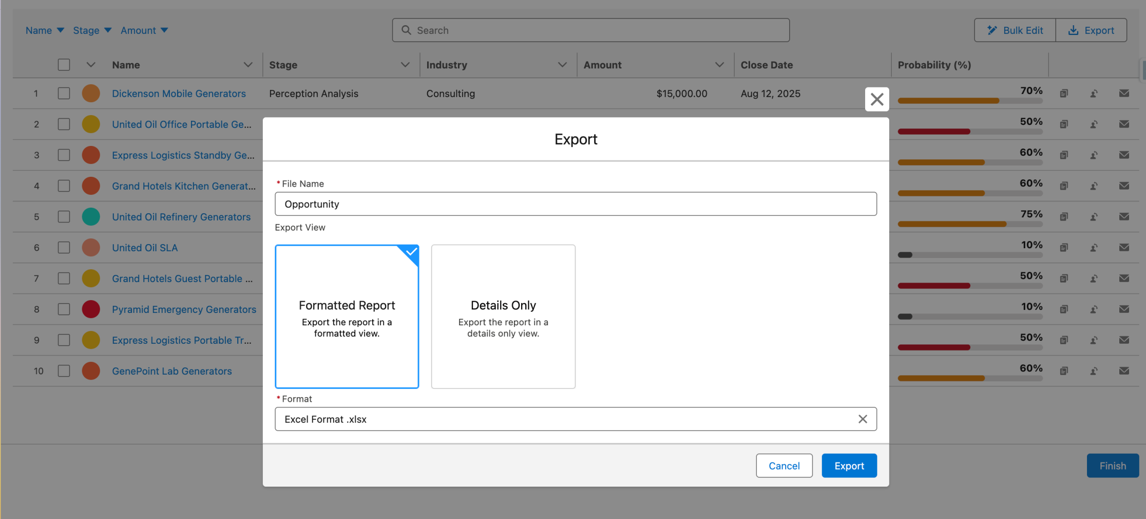
A Data Table with search and inline editing where a related list isn't enough
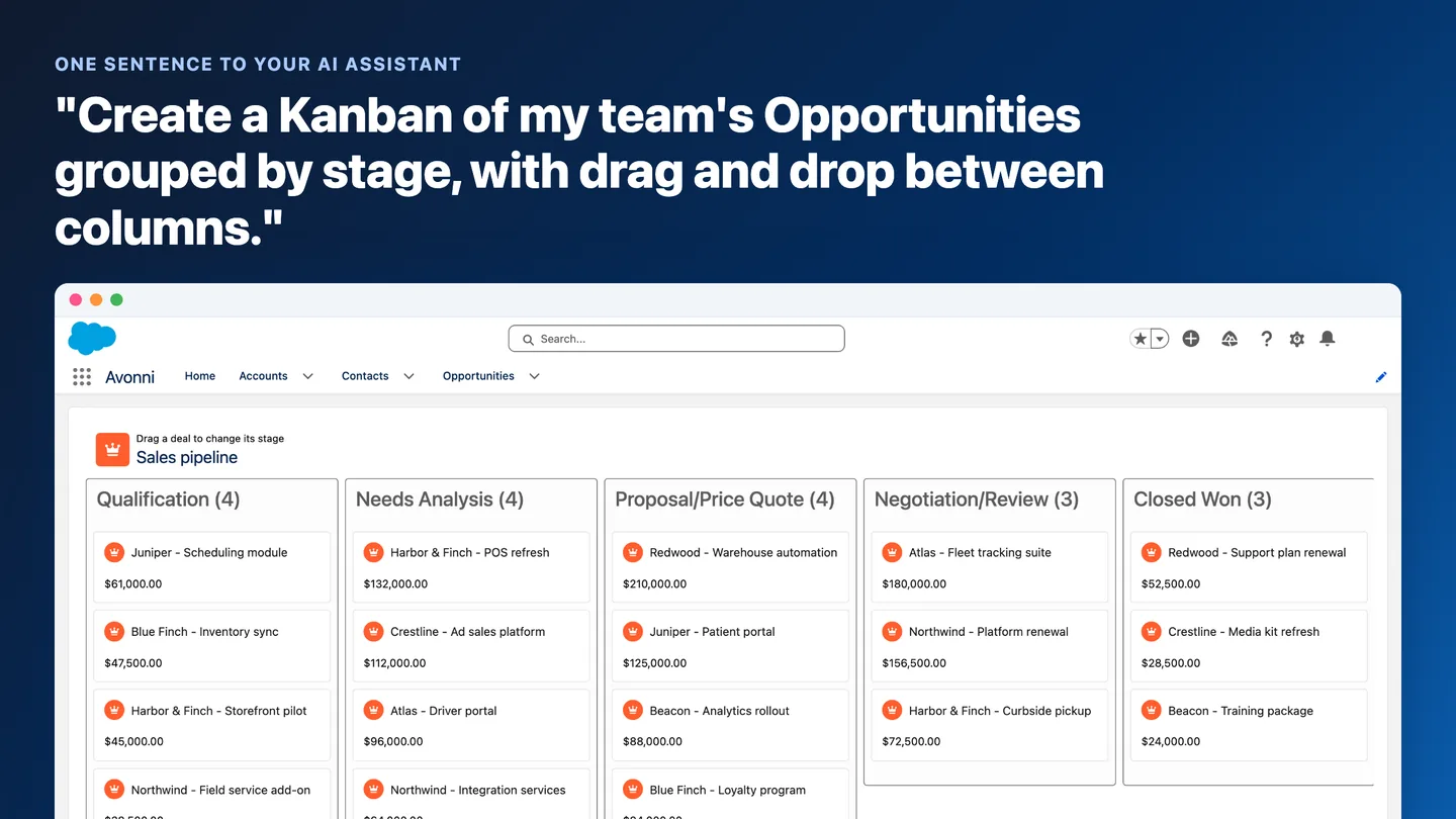
A Kanban board to move opportunities or cases between stages
A Map for accounts, contacts, or assets with an address
A Pivot Table and Metric for numbers on the record page itself, without building a report first
A Kanban board on a Lightning page: listings grouped by stage, with a total per column. Something a related list can't show.
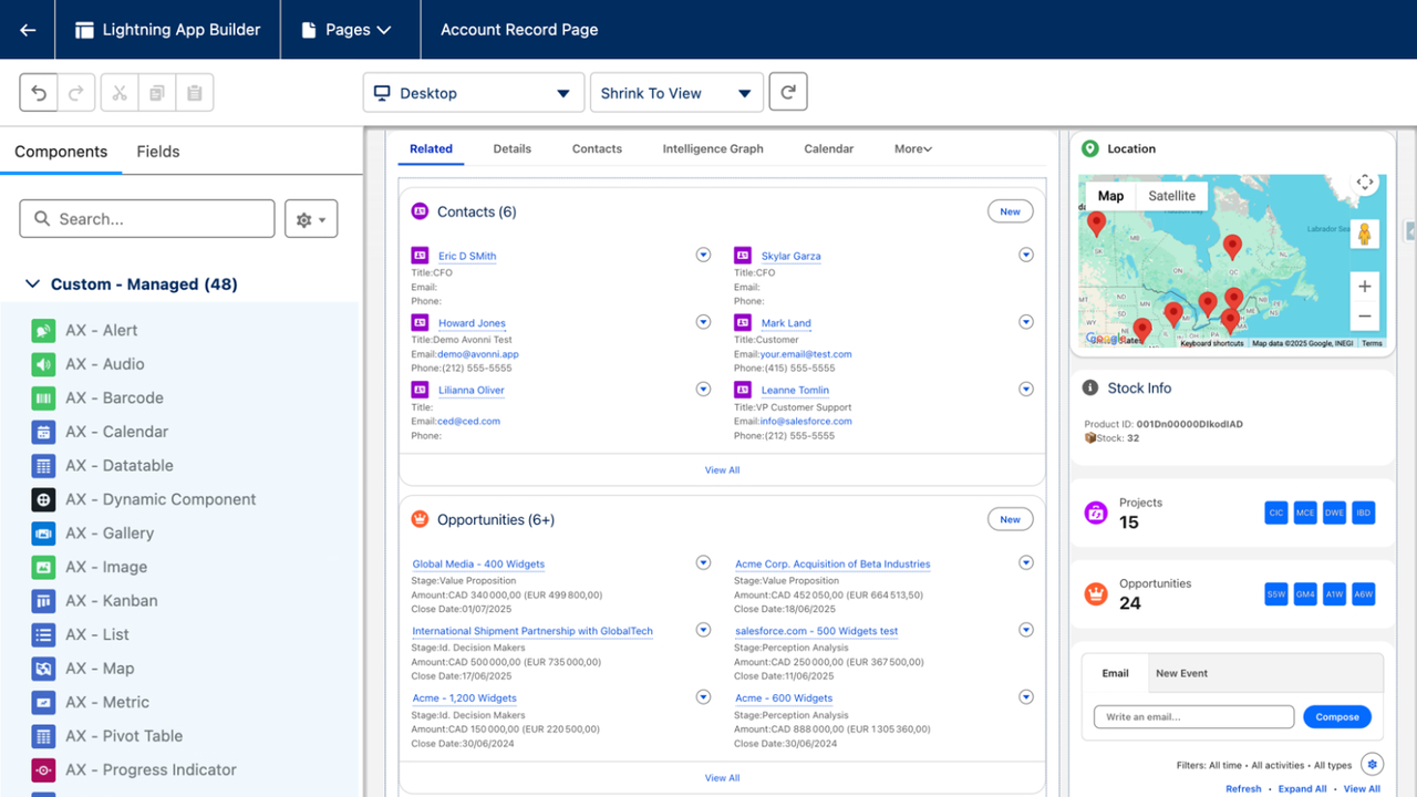
Setup works like a standard component. After install, you find them in the custom components section of the palette, labeled "AX". You configure them in the properties pane with object and field API names, filters based on page context, and checkboxes for search and inline editing. No Apex and no code.
After install, Avonni's components show up in the palette's custom section with the "AX" prefix, ready to drag onto the page.
Two honest limits. First, App Builder components are standalone: they don't talk to each other on the page. If you need a table that filters a map, or several components working as one screen, Dynamic Components is the better fit. Second, they're built for Lightning pages. For screen flows and Experience Cloud sites, Avonni offers Flow Screen Components and Experience Cloud Components, and the component library shows what's available where.
On cost, Avonni starts free with 10 production licenses and unlimited sandboxes. Paid plans start at $500 USD per month, billed annually. Details are on the pricing page. The package passed Salesforce's security review and is listed on the AppExchange. For a closer look at each component, read 17+ Components Every Salesforce Admin Needs. For the same question inside Flow Builder, see the Salesforce Flow Screen Components guide.
Frequently Asked Questions
How much does Lightning App Builder cost?
Nothing extra. Lightning App Builder is included in Group, Essentials, Professional, Enterprise, Performance, Unlimited, and Developer Editions. There's no separate license for the builder: if your org runs one of these editions, it's already in Setup. A free Developer Edition org includes it too, which makes it a good place to practice. What can cost money is what you put on the page. Some standard components need a specific product or permission, like CRM Analytics dashboards, Service Cloud Voice components, or Rebate Management. AppExchange components have their own pricing, from free to paid per user.
What are the benefits of Lightning App Builder?
No code. Admins build record, app, and Home pages by dragging components and filling in properties.
One page per audience. You assign pages to specific apps, record types, and profiles, so each team sees what it needs.
Desktop and mobile from one build. Record and app pages work in Lightning Experience and the Salesforce mobile app, and Device visibility rules let you tailor each.
Show the right thing at the right time. Visibility rules hide or show any component based on record values, the user, permissions, or device.
Extensible. When standard components aren't enough, custom LWCs and AppExchange components drop onto the same canvas and use the same visibility rules.
App setup in the same place. Branding, navigation, and the utility bar for Lightning apps are managed in the same tool.
What are the three standard component types available in Lightning App Builder?
Lightning pages support standard components (built by Salesforce), custom components (built by you or someone else, usually as Lightning Web Components), and third-party components from the AppExchange.
How do I show a component only for certain records?
Select the component, then in the properties pane click Add Filter under visibility. On a record page, pick a record field, such as Stage, Type, or the record's ID field, choose an operator, and enter a value. You can combine several filters with AND/OR logic. The component stays hidden until the conditions are true.
Can I add a dashboard to a Lightning record page?
Not with the standard Dashboard component, which works on app pages and Home pages only. Use a Report Chart filtered to the current record, a CRM Analytics dashboard component if you have CRM Analytics, or an AppExchange component that charts records directly on the page.
Bottom Line
Start with the standard components: they cover record details, related lists, reports, flows, and layout at no extra cost. Know their limits so you recognize when you've really hit one. When the need is a kanban board, calendar, map, or editable table that admins can maintain without code, an AppExchange package is usually quicker to roll out and maintain than a custom LWC. Whichever you pick, test it in a sandbox first.