Avonni August 28 Release: Record Grid, Heatmap and Treemap Charts
Record Grid puts records side by side on a flow screen, Heatmap and Treemap join the chart library, and Kanban cards can finally be ranked inside a column.
The August 28 releases are out: LWC Components 1.11, Dynamic Components 1.54, Flow Components 6.32, and Experience Components 1.27. The through line this time is comparison. A new Flow component that puts records side by side, two new chart types for reading density and proportion, and a set of changes that let people rank records by priority and reach ones a flat list was hiding.
Record Grid: put three records next to each other
Tables are built for scanning down a list. They are bad at the other job: holding two or three records up against each other to see where they differ. Reviewers work around it by opening records in separate tabs, or by exporting to a spreadsheet and transposing it by hand.
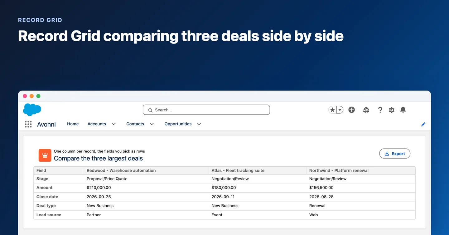
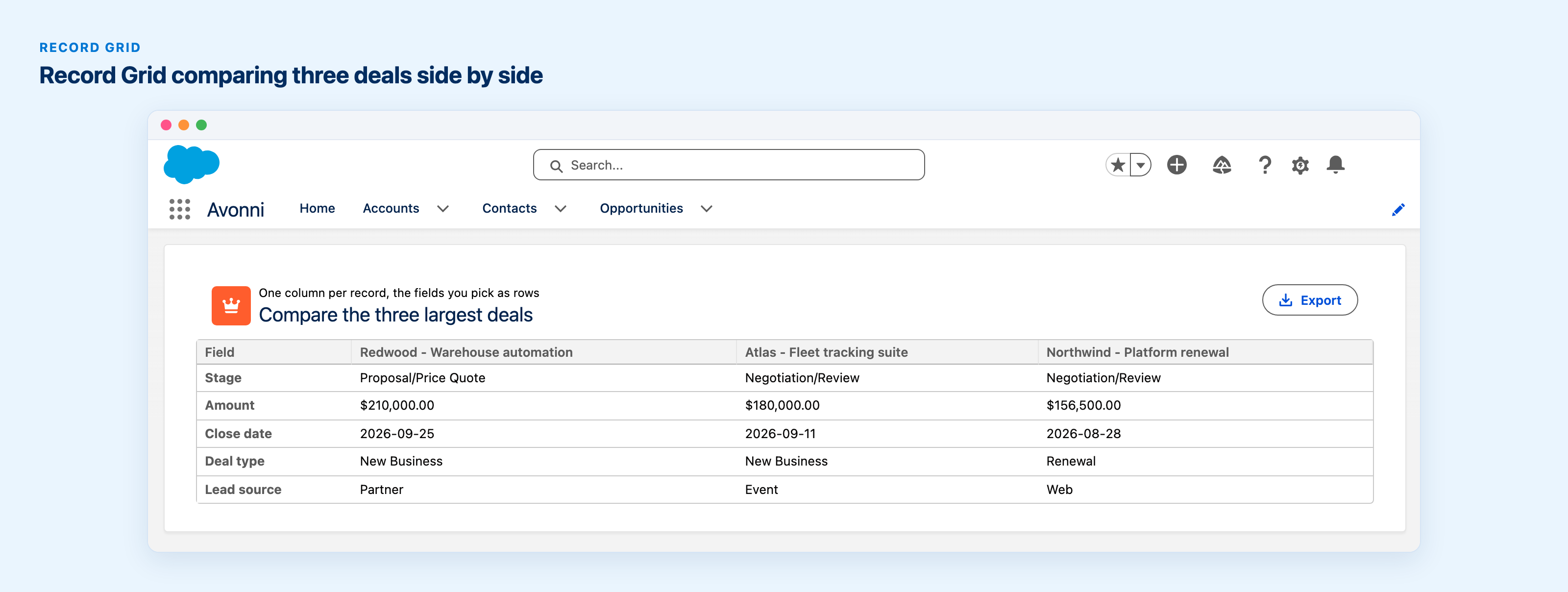
The Record Grid, new in Flow Screen Components 6.32, turns the table on its side. One column per record, headed by whatever identifies it, and the fields you choose running down as rows. Point it at an in-flow resource, a Get Records collection or a selection made in a Data Table, and a grant reviewer can read three submissions against each other on one screen. It supports download, field help text, a frozen top row and left column, and cell sizing you control.
Applicant comparison, quote versus quote, this year's numbers against last year's: anything where the question is "how do these differ" rather than "what do we have".
Heatmap and Treemap: two new ways to read a data set
A bar chart answers "how much". It is less good at "where is the pressure" or "what share of the whole". Two new chart types join the library as a Grids family.
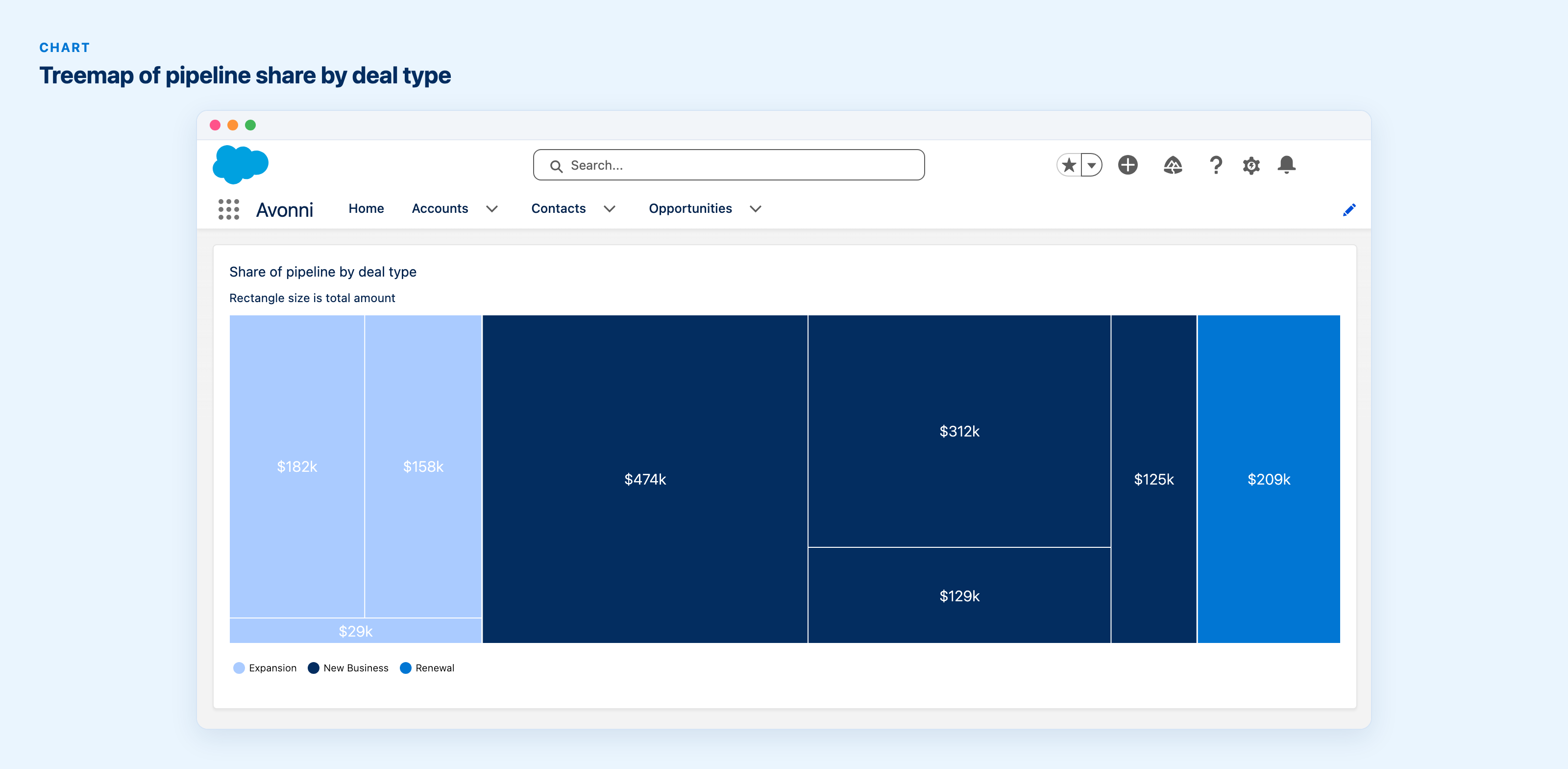
The Heatmap plots a category on each axis and colors every cell by a numeric measure. Support tickets by weekday and hour, revenue by region and quarter: the busy block and the dead zone both show up as color, before anyone reads a number. The Treemap shows nested rectangles sized by value, which is the shape to reach for when the question is proportion rather than trend.
Both use the same data model and color configuration as the rest of the chart family, so a chart already wired to a query can be switched to one of them without rebuilding the data side.
Charts that match your brand, gauges you can actually read
Charts used to be limited to 15 predefined palettes, which is fine until a customer-facing dashboard has to follow a brand book. A new Custom Palette property takes a list of your own hex colors and overrides the preset, so the chart cycles through your colors in the order you list them.
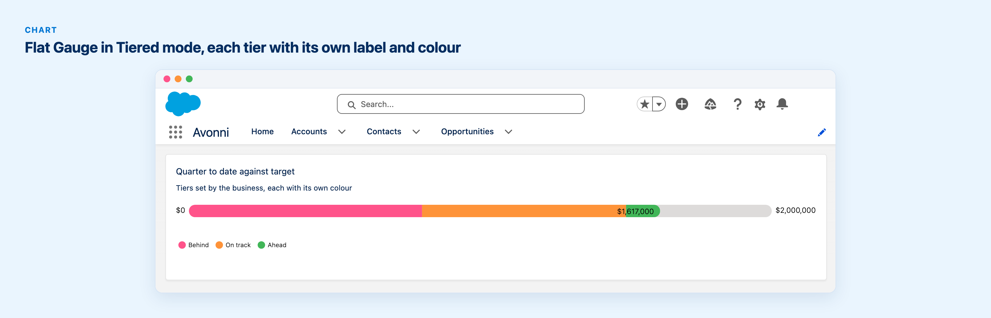
The Radial Gauge has been redesigned around a large centered value with a filled progress arc, and it picks up two controls: the indicator can be a needle or a circle, and the tick values along the arc can be hidden when the number is the point. The Flat Gauge gains two display types alongside Continuous. Discrete splits the track into a set number of steps. Tiered lets you define each tier yourself, with its own label, share of the range, and color, which is the one to reach for when the bands mean something to the business.
Kanban: priority is not the same as status
A Kanban column tells you what stage something is in. It has never told you what to pick up first, because the order of the cards meant nothing. Cards can now be dragged up and down inside a column to sequence them by priority without changing their status, the same drag-to-reorder the List component already offered.
Two more things landed on the board. Swimlane headers can show a configurable total next to the record count, so a subgroup can report pipeline value and not just card count. And card fields, filters and sorting now reach fields on related and parent objects several levels deep, so a board can group on an account's owner without a formula field standing in for it.
Everyone at the same address
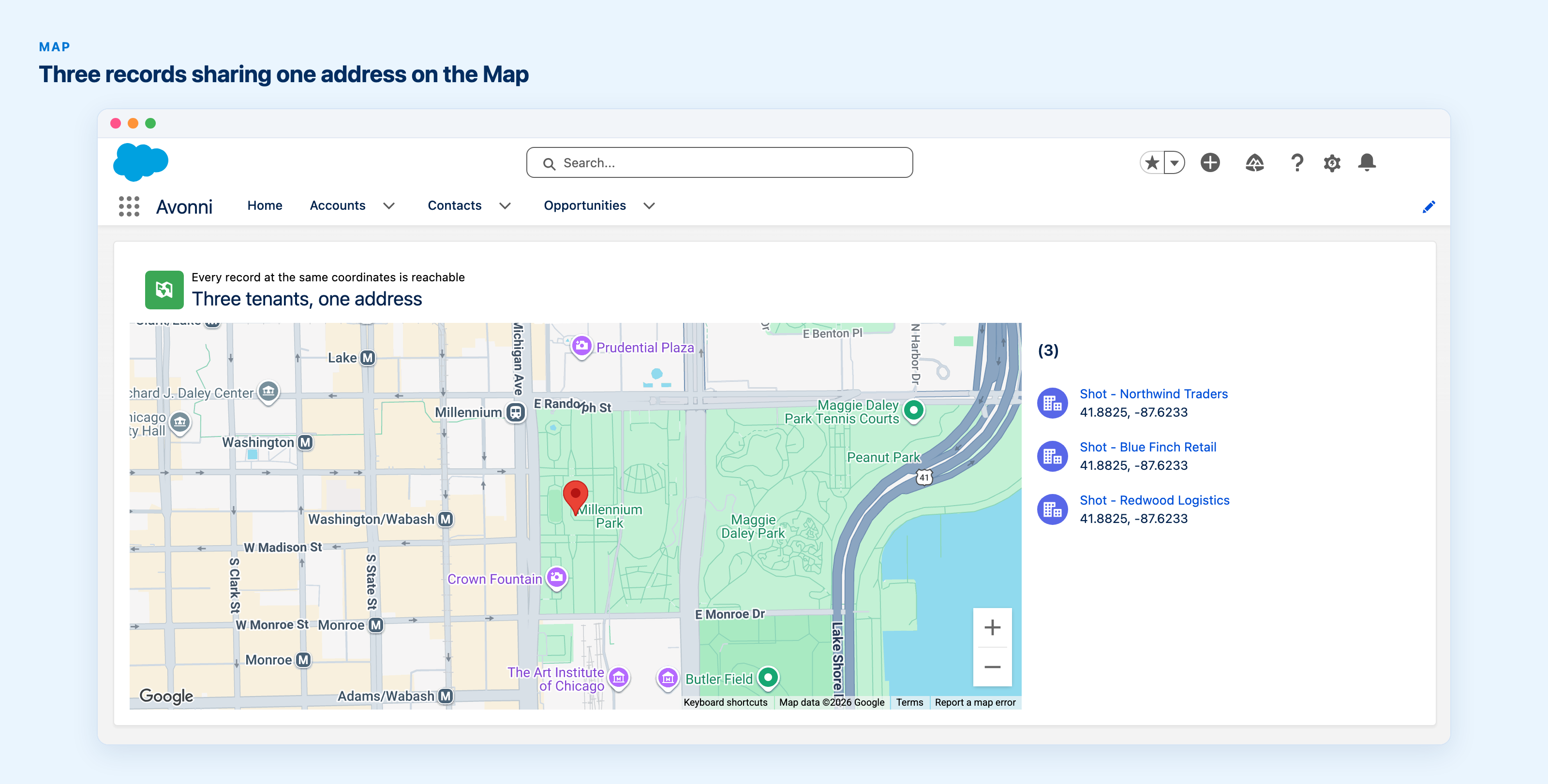
Several accounts registered at one shared office building used to collapse into a single map marker, and only the topmost one answered a click. The others were on the map and unreachable, which is the kind of bug people work around by editing a record's address until the pin moves.
Every record at those coordinates is now reachable: page through them from the marker popup, with the addresses left alone.
Also in this release
Record Detail can scope Custom Layout fields to the record types they apply to, so one layout serves an object whose record types differ in a few fields instead of needing one layout each. Chat gains replies to a specific message, with a quoted preview of the original and a click that jumps back to it. The Scheduler's event detail popover can render your own markup instead of the default field list, for anyone composing it in their own Lightning Web Component. And the picklist values editor now opens beside the item you are editing rather than on top of the list.
Bug fixes
The Data Table cluster is the one worth reading. Maximum row selection is now enforced across pages: the header select-all used to add up to the maximum on every page, and row checkboxes stayed clickable past the limit after a page change, so a flow could quietly receive more records than it was configured to accept. Exporting after Select All Items now returns the same set as exporting an individual selection, and a lookup column mapped to the record's own Id no longer renders blank in query mode.
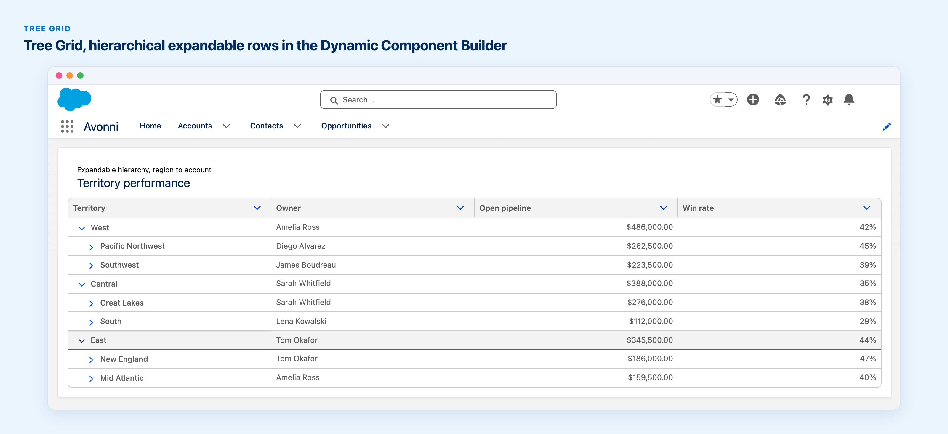
Elsewhere: Tree Grid columns with Linkify ticked render as links again, a chart whose measure field is not visible to the running user reports an error instead of rendering blank with no explanation, and a Pivot Table filter on a lookup name now matches people whose name runs past a first and last, which had been returning "No results" for records the filter itself had counted. The full list is in the release notes.
Get the update
Recommended
Avonni Experience Components v1.27
The full bundle: Dynamic, Experience Sites, and App Builder components.
Co-founder of Avonni, Cédric leads Customer Success across the entire Salesforce-native product suite. He focuses on accelerating time-to-value and driving product adoption for admins and teams building high-performance UIs without code.