Data visualization

Turn Salesforce data into visualizations people actually read

Standard reports and related lists bury the story. Avonni turns the same records into data tables, kanban boards, maps, and timelines your users actually open, all configured without code.

25+
column types on the data table
85+
components across the suite
3
surfaces: Flows, pages, portals
What you build

Views your users open on purpose

Point Avonni at any object and shape the records into something worth looking at, with filtering, grouping, and inline actions built in.

Standard report
Avonni visualization

Data-rich record pages

Replace flat related lists with sortable tables, metrics, and charts that surface what matters on the record.

Operational boards

Give teams a kanban or list view they can filter, group, and act on without leaving the page.

Customer-facing views

Show the same data in a portal, styled to match the brand and safe for external users.

The star components

Four ways to make data readable

Each one reads live Salesforce data and configures without code. Mix them on the same page or use them on their own.

Tabular

Data Table

25+ column types, inline editing, filtering, grouping, and row actions on any object.

See it →
Board

Kanban

Group records into columns and drag cards to update them, with counts and per-card actions.

See it →
Geographic

Map

Plot accounts, contacts, and assets as markers, with clustering and a linked list view.

See it →
Chronological

Timeline

Show activities and events in order, grouped by day, week, or month, with filtering and search.

See it →
Working with dates? See the Calendar component →
Same components, every surface

Build once, use it everywhere

The same visualizations run wherever your users are, so you configure a view once and reuse it across the org.

In Screen Flows

Drop a data table, kanban, or map straight into a guided flow so users see and act on data mid-process.

Flow Screen Components →

On Lightning pages

Add the same views to record and app pages, configured visually with no Apex behind them.

Dynamic Components →

In portals

Bring the visualizations to Experience Cloud sites, branded and safe for external users.

Experience Cloud Components →
Built in, not bolted on

The interactions users expect, ready to configure

Filter & search
Narrow to the rows that matter
Inline edit
Update records in place
Group & drag
Reorganize without a page reload

These behaviors come with the components. You configure what shows and how it groups, and your users get a view they can work in, not just look at.

From a customer
“Avonni has enabled our team to spend more time on strategic development and user interface enhancement changes than ever before. Gone are the days when lengthy code blocks and customisation are required.”
Craig Ashton-Chalmers
Linklaters
In a real org

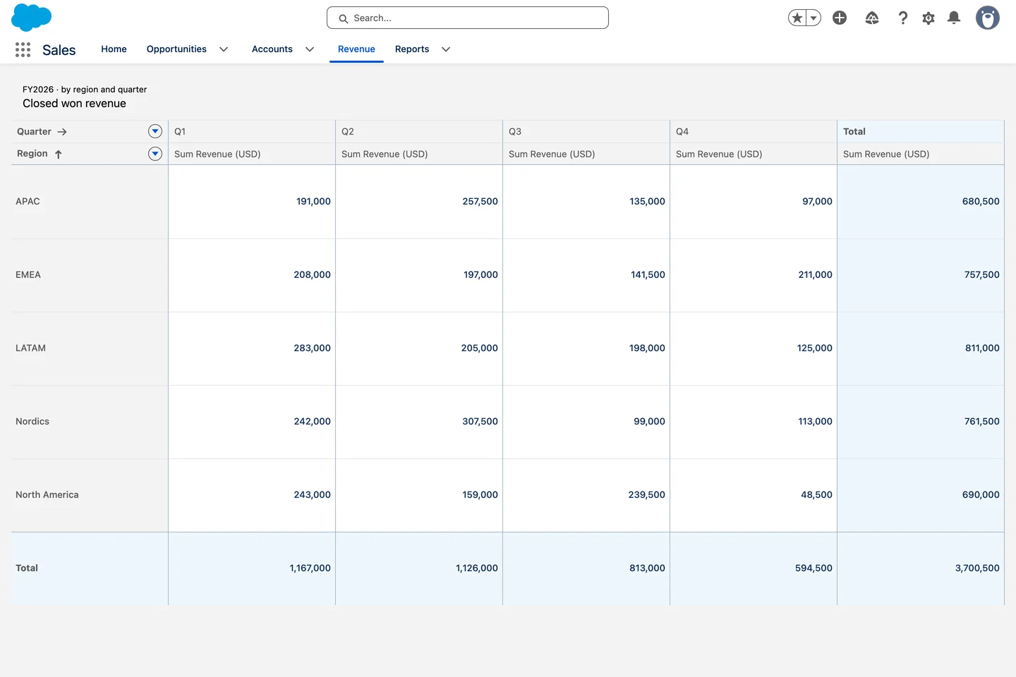
A revenue cube, built on one Pivot Table.

All use cases
FAQ

Common questions

Where does the data come from?

Straight from Salesforce. Point a component at an object, a report, or a flow variable, and it reads live records. No sync, no external database.

Do I need code to configure them?

No. Columns, grouping, filters, colors, and actions are all set through configuration. Developers can go further, but nothing here requires Apex.

Can users edit records from the view?

Yes. The data table supports inline editing, and components can expose row and card actions so users update records without leaving the view.

Do the same components work in Experience Cloud?

Yes. The data visualization components run on Lightning pages, in Screen Flows, and on Experience Cloud sites, so external users see the same views.

Give your data a view worth opening

Start free with 10 licenses and build your first data table, kanban, or map today. No code, no Apex, no sync.