For UI/UX Designers

Design Salesforce screens you can actually ship

Every component you place already exists in the org, security reviewed and SLDS-native. What you design is what gets built, with no custom LWC standing between the mockup and production.

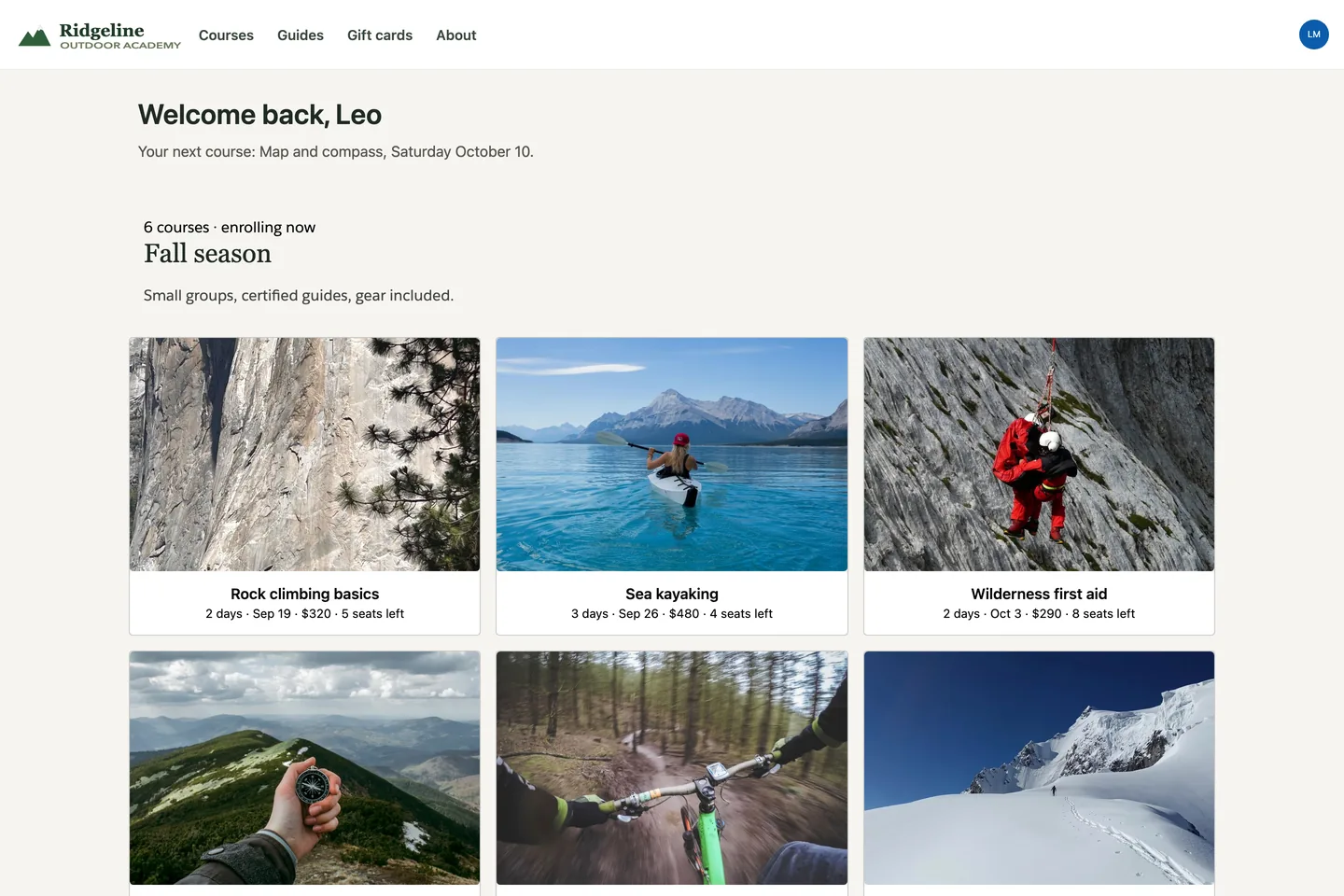
Avonni Gallery on the Ridgeline Outdoor Academy site, a live Experience Cloud site: branded header, a welcome line for the signed-in member, and six fall courses with photo, dates, price and seats left
Experience SitesPortal pageAn outdoor school lists its fall courses: six photos, dates, price and seats left. One component, six records.
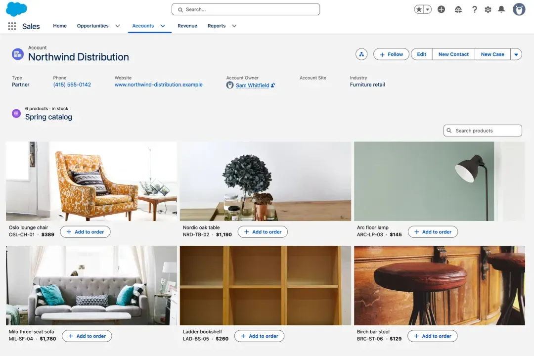
Avonni Image List on a Salesforce Account record page: six product photos in three columns, each with name, SKU, price and an Add to order button
Lightning PagesRecord pageThe spring catalog on the account record: six products, one photo each, an Add to order button under every tile.
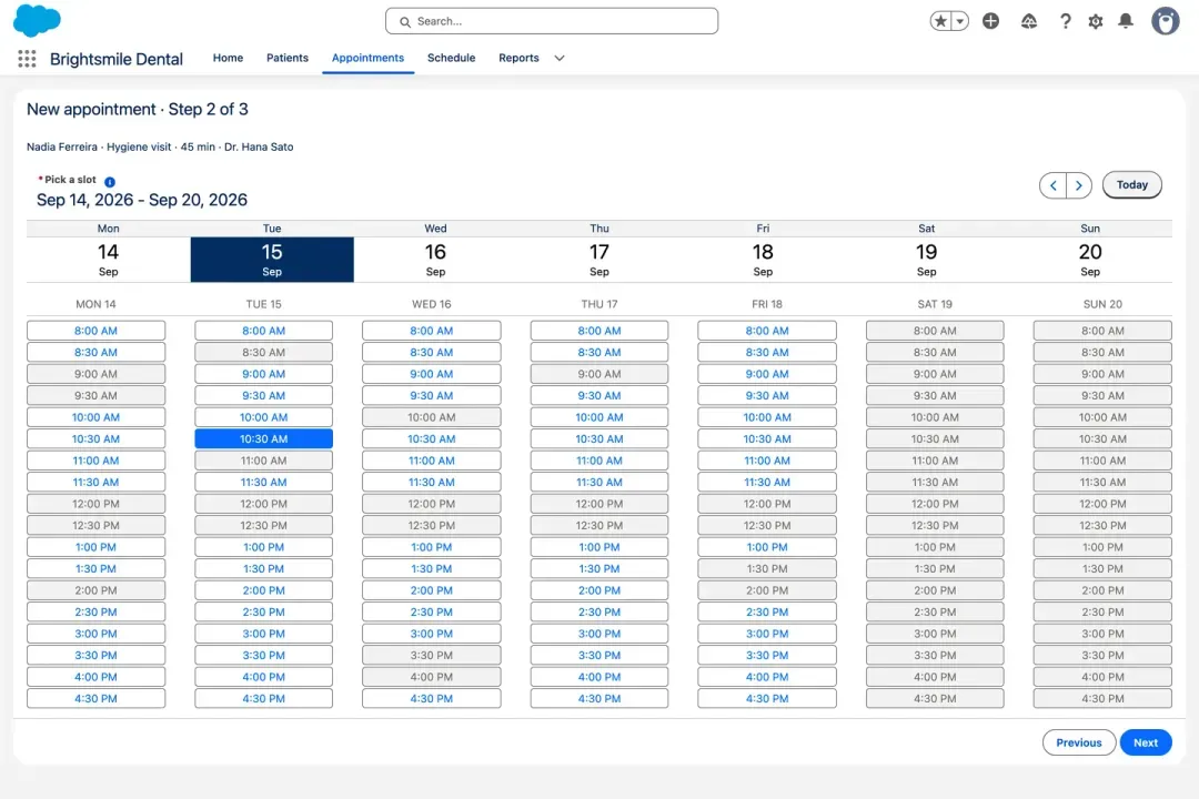
Avonni Date/Time Picker on step 2 of a Salesforce flow: a week of thirty minute dental slots with lunch, booked slots and the weekend greyed out, Tuesday 10:30 selected
Screen FlowsFlow screenOne week of slots, lunch and taken slots greyed out, one tap to pick, straight into the record.
What you place

Design with components that already exist

Real screens from real orgs. Every tile, table and timeline here exists in the org before you draw it.

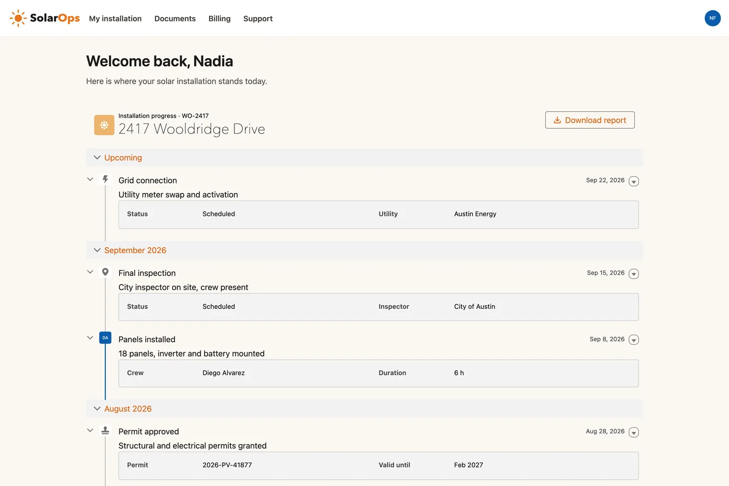
Avonni Timeline on a customer portal page: seven installation steps grouped by month, each with two facts, initials or icons, and a Download report button

A portal page, as designed. Seven installation steps on one timeline, two facts per step, a menu on every step.

0
custom LWC

Between the mockup and production. The component is already in the org.

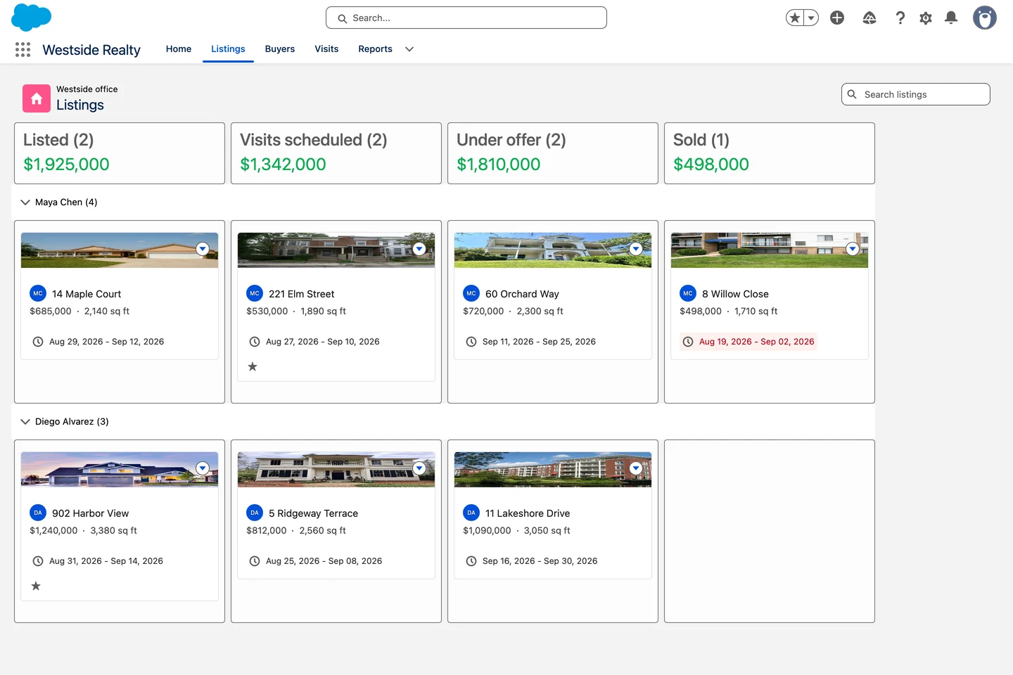
Avonni Kanban on a Lightning page: real estate listings grouped by stage, one swimlane per agent, photo on each card and a dollar total per column

A board with a real hierarchy. Photo first, price and window under it, a total at the top of each column.

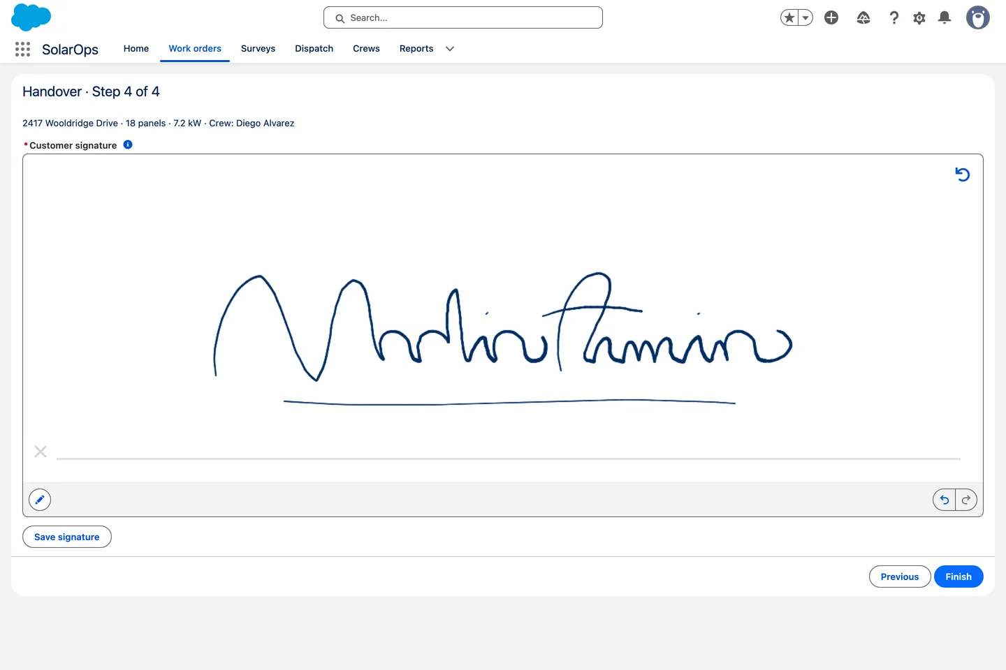
Avonni Pen Input on the last screen of a Salesforce flow: a handwritten signature in blue ink on a signature pad, a reduced toolbar and a Save signature button

A flow step that feels finished. A signature pad with a reduced toolbar and one clear action.

See them in real orgs
→
Why designers switch

The gap between the mockup and the org

The old way

You design the screen you want, then cut it down to what standard components can do. The rest waits on a dev ticket that may never come.

→
With Avonni

You design with components already installed in the org. What you hand over is configured, not specified, and it ships the same week.

The fine print

The details you get asked about

✓
SLDS-native

Matches Salesforce out of the box and survives three releases a year.

✓
Custom branding

Colors, fonts, and spacing per component. No CSS to write, no theme override to maintain.

✓
Real states

Empty, loading, error, and inline edit come built in, so you are not specifying each one by hand.

✓
Responsive by default

The same component holds up on a laptop and in the Salesforce mobile app.

“

Avonni has enabled our team to spend more time on strategic development and user interface enhancement changes than ever before.

Craig Ashton-Chalmers · Linklaters
Before you install

What designers ask

Do I need an admin to try this?

No. Install it in a free developer org and build on your own. When you move to a real org, ten production licenses are free.

Can I keep designing in Figma?

Yes. Most designers keep Figma for flows and wireframes, then build the high-fidelity screen with real components on real data.

Will it match our brand?

Colors, fonts, and spacing are set per component, and Experience sites adopt your theme.

What happens at handoff?

There is no rebuild. The screen you configured is the screen that runs, and an admin or developer takes it from there.

Ship the screen you designed

Install Dynamic Components and rebuild one record page this week. Free for up to 10 production users, unlimited in sandboxes.