The Avonni Data Table for Salesforce Screen Flows

Built for editing, not just display. Inline editing for every field type, 25+ visual column types, filtering, and row actions — all inside Flow Builder, no code.

✓ Passed Salesforce security review · Free up to 10 users

5-star rating on Salesforce AppExchangeSalesforce AppExchange badge

The Avonni Data Table
Turn Your Flows into Interactive Data Screens

The Avonni Data Table goes beyond display and selection. Here's what it lets you build — no code required.

Visualize your data where it matters

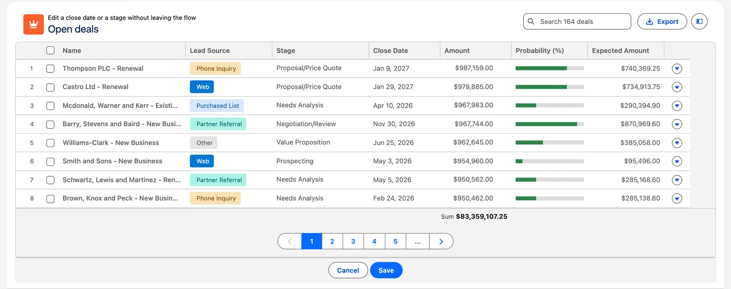
The Avonni Data Table makes tables more than grids — show status with badges, progress with bars, people with avatars, and key metrics with conditional colors. Users scan instantly instead of reading every cell.

Badges
Progress bars
Avatars
Ratings
QR codes
25+ types
Standard Salesforce Data Table: Text and numbers only — no visual indicators

Edit everything without leaving the table

With the Avonni Data Table, users update numbers, dates, picklists, checkboxes, and even lookup fields directly inline. No separate edit screens, no extra flow steps — just click, change, and move on.

Text
Numbers
Dates
Picklists
Checkboxes
Lookups
Standard Salesforce Data Table: Text fields only (Spring '26)

Take action right from the row

The Avonni Data Table supports per-row action menus to edit, delete, open a sub-flow dialog, or navigate to a record — without leaving the table. Add header buttons for bulk actions like "New Record" or "Export CSV."

Row actions
Header buttons
Sub-flow dialogs
CSV export
Standard Salesforce Data Table: No row actions, no header buttons, no export

Group, filter, and make sense of large datasets

The Avonni Data Table lets you group rows by any field with collapsible headers and automatic row counts. Add a built-in filter panel so users can narrow down hundreds of records without you building separate filter components.

Data grouping
Filter panel
Collapsible groups
Row counts
Standard Salesforce Data Table: No grouping, no built-in filter UI

Build in minutes, not hours

The Avonni Component Builder lets you drag-and-drop columns, configure styling, and see a live preview as you build. Start from templates and customize — or use the built-in query data source so you don't even need a Get Records element.

Visual builder
Live preview
Templates
Built-in query
Standard Salesforce Data Table: Manual property panel, no preview, no templates

One package, 70+ components

The Data Table is just one of 70+ Flow Screen Components in the Avonni library. Install once and get access to Kanban, Calendar, Map, Combobox, Visual Picker, List, Charts, and more — all with the same builder experience.

Kanban
Calendar
Map
Combobox
Visual Picker
70+ total
Standard Salesforce Data Table: Each component is standalone with limited capabilities
25+

Column display types in Avonni

Badges, progress bars, avatars, ratings, QR codes, and more
6

Editable field types

Text, numbers, dates, picklists, checkboxes, lookups
75+

Flow Screen Components

Data Table is part of the full Avonni component library

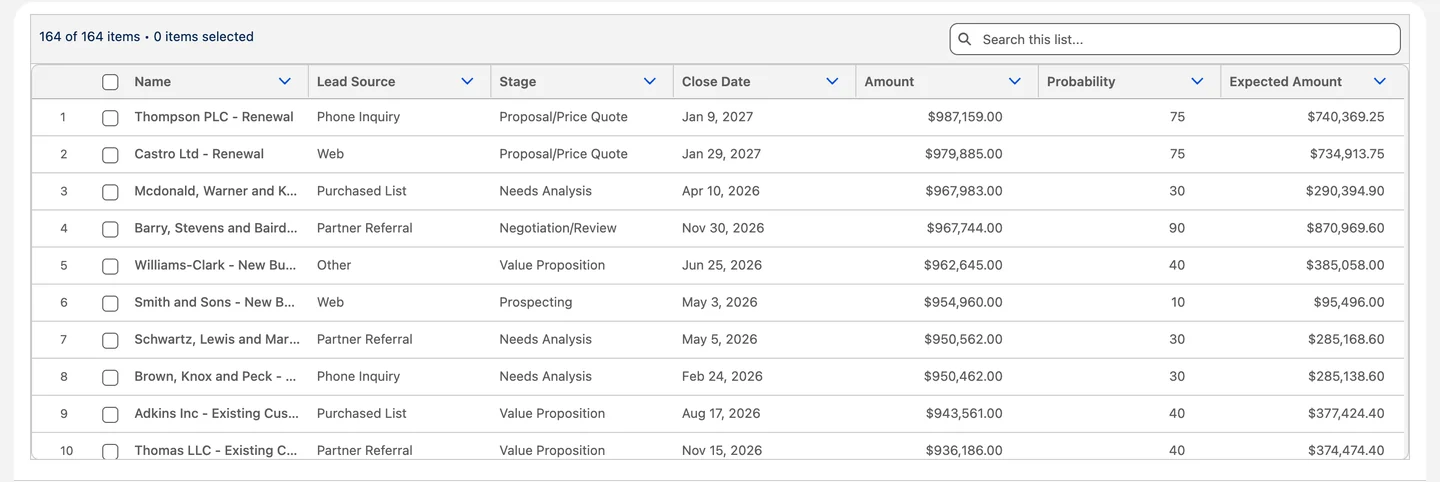
Salesforce's standard Data Table was built for selection
— not interaction

The standard Data Table component in Flow Builder does one thing well: display records and let users pick one. But when your flows need more — editing, visual indicators, row actions — you hit its limits fast.

Editing is limited to text fields

The standard Data Table only supports inline editing of text-type fields (as of Spring '26). Need to edit a date, picklist, or number? Users have to leave the table, open a separate screen, and come back.

No visual column types

The standard Data Table renders every column as plain text. No badges, no progress bars, no color coding. A "90% complete" task looks identical to a "5% complete" one.

No filtering, no row actions, no export

The standard Data Table has no built-in filter panel, no row-level action menus, and no CSV export. If users need to narrow down 500 records or act on a specific row, you have to build all of that yourself.

No visual builder or templates

The standard Data Table is configured one property at a time in the Flow Builder sidebar. No live preview, no templates, no drag-and-drop. Building a 10-column table takes longer than it should.

25+

Column display types in Avonni

Badges, progress bars, avatars, ratings, QR codes, and more
6

Editable field types

Text, numbers, dates, picklists, checkboxes, lookups
75+

Flow Screen Components

Data Table is part of the full Avonni component library

Standard Data Table vs. Avonni Data Table — feature by feature

Both components are Data Tables for Flow Builder

FEATURE COMPARISON
Top Features
Standard Data Table
Avonni Data Table
Rich column types
Badges, progress bars, avatars, ratings, QR codes, conditional colors
Not included
No visual indicators or rich formatting
Included
25+ column display types
Status badges, progress bars, avatars, ratings, QR codes, and more
Full inline editing
Edit all field types directly inside the table
Not included
Text Fields Only
New in Spring '26 — limited to text-type fields
Included
All field types
Text, numbers, dates, picklists, checkboxes, lookups
Row actions
Per-row action menus with edit, delete, custom flows
Not included
No way to trigger actions from individual rows
Included
Full action framework
Built-in lookup traversal (e.g., Account › Name)
Built-in filter UI
Configure columns, styling, and data source with live preview
Not included
Must build separate filter components in the flow
Included
Built-in filter panel
Select which fields to expose as filter controls
Data grouping
Group rows by any field with expandable headers, counts, and sorting
Not included
No built-in way to group or categorize rows
Included
Full grouping engine
Group by any field — collapsible headers, row counts, custom sort, linkified lookups
Data Source
4 features
Standard Data Table
Avonni Data Table
Get Records Collection
Included
Included
Built-in Query data source
Not included
Must build Get Records element separately
Included
Visual Query Builder
No Get Records needed — configure directly in component
Lookup field display
Not included
Workaround: create formula fields on the object
Included
Shows related name
Built-in lookup traversal (e.g., Account › Name)
Reactive to source changes
Included
Via advanced setting
Included
Native reactivity
Column Display Types
10 features
Standard Data Table
Avonni Data Table
Standard fields (text, number, date, currency, email, phone, URL, boolean)
Included
Included
Status badges
Not included
Included
Color-coded Badges
With conditional color mapping per value
Progress bars
Not included
Included
Images & avatars
Not included
Included
Action buttons per row
Not included
Included
Button, button icon, action menu
Interactive inputs (combobox, counter, slider, rating, color picker)
Not included
Included
All supported
Turn cells into editable UI controls
QR code & barcode
Not included
Included
Conditional cell coloring
Not included
Included
Based on field values
Hyperlink columns
Included
Included
File Upload
Not included
Included
Inline Editing
8 features
Standard Data Table
Avonni Data Table
Text fields
Included
Included
Number, currency, percent
Not included
Included
Date & date/time
Not included
Included
Picklist / dropdown
Not included
Included
Via combobox column
Boolean / checkbox
Not included
Included
Lookup / relationship
Not included
Included
Supported
Edit lookup fields directly in the table
Edited Rows output
Included
Included
Required field validation
Not included
Included
Per-column required
Search, Selection & Action
11 features
Standard Data Table
Avonni Data Table
Search bar
Included
Included
Field-level filter UI
Not included
Included
Built-in filter panel
Select fields to expose as filter controls
Multi-select / single-select / view-only
Not included
Included
Column sorting
Not included
Included
Per-row actions (edit, delete, custom)
Not included
Included
Full action framework
Update records, open flow dialog, navigate, etc
Header actions (buttons above table)
Not included
Included
Data export (CSV)
Not included
Included
Built-in export
data grouping
Group rows by field
Not included
Included
Group by any field
Group row counts
Not included
Included
Automatic counts
Linkified group headers
Not included
Included
Click to open record
Non-collapsible mode
Not included
Included
Lock groups open
Styling & Configuration
4 features
Standard Data Table
Avonni Data Table
Column width, alignment, wrapping
Not included
Users can resize at runtime but no admin defaults
Included
Custom styling (colors, borders)
Not included
Included
Headers, cells, conditional
Visual drag-and-drop builder
Not included
Included
Avonni Component Builder
With live preview and templates
Show/hide columns conditionally
Not included
Included

The Data Table is just the beginning

Install Avonni once and get 70+ Flow Screen Components in the same package — all built with the same Component Builder, all configurable without code. If your flow needs it, it's probably already in there.

Visual Comparison

See the difference

The same dataset displayed in both components. Notice the gap in column types, visual richness, and available interactions.

Sales opportunities dashboard with Avonni Components for Salesforce showing a list of opportunities with names, amounts, stages, and opportunity types, alongside a summary of open opportunities by sales stage and a progress tracker with four steps.

Your Screen Flows deserve a better data table

Install Avonni free and get inline editing for every field type, 25+ visual column types, built-in filtering, and row actions — all inside Flow Builder. No code required