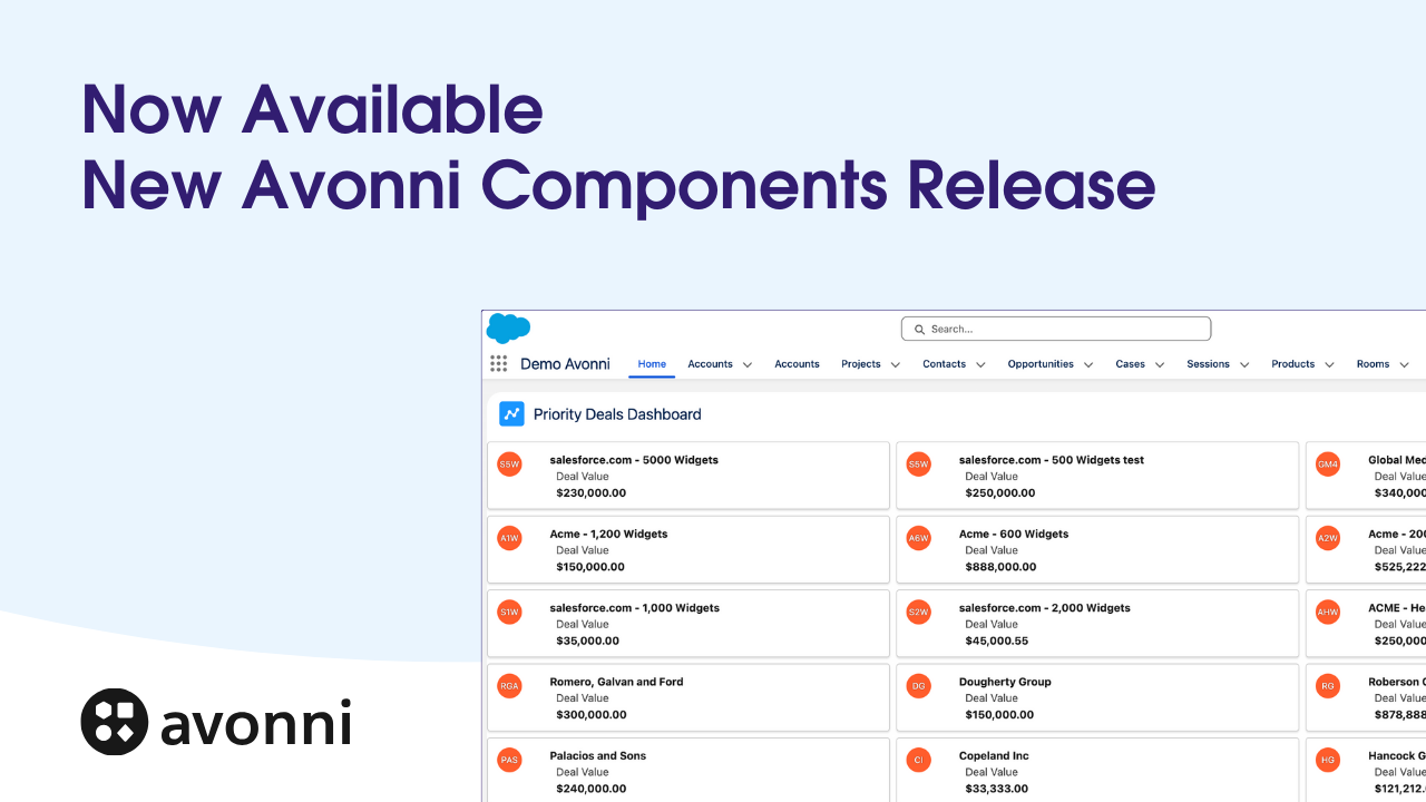
Take Your Salesforce User Experience to the Next Level. Create Salesforce Apps 10x faster. - 70+ Flow Screen Components - 40+ Experience Cloud Components - Free up to 10 users
Avonni Components passed Salesforce's security review and is listed on the AppExchange
Take Your Salesforce User Experience to the Next Level. Create Salesforce Apps 10x faster. - 60+ Flow Screen Components - 30+ Experience Cloud Components - Free up to 10 users
Avonni Components passed Salesforce's security review and is on the AppExchange
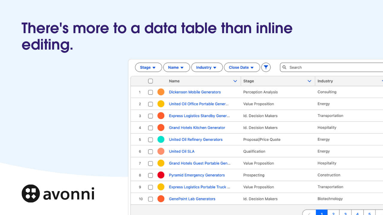
The Avonni Data Table ships with default styling. Two configuration moves align it with your Salesforce theme: set header and footer background colors, and pull the table to the container boundary. Both take seconds.
Why visual consistency matters for adoption
Your users notice when components look out of place. A Data Table with default styling stands out visually from your Salesforce interface—slightly different colors, spacing, typography. It's a small friction point. Over time, small friction adds up. Users question whether they're looking at a trusted part of your org or something custom and unfamiliar.
Visual consistency builds confidence. When your Avonni Data Table matches your Salesforce theme—the same header colors, the same typography weight, the same visual hierarchy—it feels native. Users trust it immediately. They work faster because they're not mentally categorizing components as "standard" versus "custom." Everything just looks like Salesforce.
This matters especially for orgs with multiple custom solutions. Consistency across all custom components signals professionalism and care. It improves adoption rates because users feel they're working within a unified, intentional design system—not a patchwork of tools.
Configuring header and footer colors
Your Salesforce org has a theme. It might use the standard blue, a custom brand color, or a specific color palette defined in your Setup. Your Data Table should reflect that.
Here's the step-by-step:
Open your Data Table in Flow Builder. Click the component to select it.
Go to the Styling tab. Look for "Header Background Color" and "Footer Background Color" settings.
Set the header color first. This is the row at the top containing column names. Match it to your Salesforce theme's primary color. If your org uses Salesforce Lightning Design System, use the equivalent token—usually a mid-blue (#0070D2) or your org's custom primary color. You'll find your theme colors in Setup > Themes and Branding.
Set the footer color. The footer is the bottom section of the table, typically used for pagination or action buttons. Keep this slightly lighter or match it to the header for visual harmony. Many orgs use the same color; others use a slightly muted version.
Test the contrast. Make sure text (usually white) sits clearly against your chosen background. WCAG standards require at least 4.5:1 contrast ratio for text accessibility. If you choose a light background color, use dark text.
Save and preview. Look at your table in Flow Builder preview mode. Does it feel like part of your Salesforce page, or does it still stand out?
Pro tip: Document your chosen colors in a team style guide. If other admins build flows later, they'll know which exact hex codes to use, keeping everything consistent.
Using boundary width to maximize space
By default, the Avonni Data Table sits inside its container with padding on all sides. This gives it breathing room but also separates it visually from the page structure. Native Salesforce components—like list views—render edge-to-edge, using the full available space.
Pulling the Data Table to the container boundary removes that padding. The table now stretches from left to right edge, matching the native Salesforce layout pattern. This does two things: it maximizes available horizontal space (important for wide data tables with many columns) and it reinforces that the Data Table is an integral part of your page, not a floating widget.
To configure boundary width:
Select the Data Table. Click it on your Flow screen.
Find "Boundary Width" or "Padding" settings. This is usually in the Layout or Spacing section.
Set left and right padding to 0. This pulls the table to the container edges.
Keep top and bottom padding minimal. A small gap (8-16px) between the table and other content is fine. Zero top/bottom padding can make the table feel cramped against elements above or below it.
Check the result. Your table should now extend edge-to-edge, like a native Salesforce component.
This single adjustment often makes the biggest visual difference. Users immediately perceive the table as "belonging" to the page.
Additional styling considerations
Row density and visual breathing room
How many rows of data should your table show before requiring vertical scroll? That depends on your use case. A tall, dense table (compact row height, many rows visible) is good for scanning large datasets. A shorter, spacious table (taller rows, fewer visible) is better for detail-oriented workflows.
The Avonni Data Table lets you control row height. Check the "Row Height" setting under styling. Compact mode uses less space; normal mode adds breathing room; spacious mode emphasizes each row. Your choice should match the task. If users are quickly filtering or scanning, compact is fine. If users are reading details or clicking into rows frequently, spacious improves usability.
Column width adjustments
Wide tables can become difficult to scan. Consider:
Fixed column widths: Set explicit widths for each column so they don't shrink unexpectedly when content changes.
Priority columns: Identify which columns matter most to your users. Allocate width accordingly. A "Status" column important for decision-making should be wide enough to read without truncation.
Truncation and tooltips: For long text fields, enable truncation and show full content in a tooltip on hover. This keeps column width reasonable while preserving access to full data.
Matching Lightning Design System themes
Salesforce publishes color palettes for light and dark themes. If your org allows users to toggle dark mode, test your Data Table in both. Dark themes typically use darker backgrounds with lighter text. Make sure your header and footer colors provide sufficient contrast in both modes.
Most orgs stick with light mode. But if dark mode is enabled in your org, users will notice if your custom component doesn't support it. You can configure separate color values for light and dark themes in the Data Table styling settings.
Make the header distinctly darker or lighter than the rows below. This creates visual separation, helping users quickly distinguish the column labels from data. The Salesforce standard uses a darker header. Follow that pattern.
The "alternating row" pattern
Some tables use alternating row colors (zebra striping) to improve readability. If your Avonni Data Table supports this setting, enable it for tables with many rows. It helps eyes track horizontally without jumping between rows.
The "footer anchoring" pattern
If your table has pagination controls in the footer, make the footer color similar to the header. This "anchors" the table visually—users know where pagination controls are without scrolling. Match colors reinforce that header and footer are structural elements, not data.
Before and after: the impact on user experience
A default-styled Data Table works. Users can interact with it, sort columns, filter rows. But it creates cognitive load. Users ask: "Is this part of Salesforce or is this a custom tool?" They move more slowly because they're subconsciously evaluating whether they can trust interactions.
A thoughtfully styled Data Table feels invisible. It fits so naturally into the page that users don't think about styling at all. They just work. They click. They filter. They export. They move faster because every interaction feels familiar and expected.
The two configuration steps—header/footer colors and boundary width—deliver 80% of that visual integration. Spending five minutes on styling pays dividends in user adoption and daily interaction speed.
That's it. Two changes. Your Data Table now visually integrates into your Salesforce page layout without extra markup or custom CSS.


.png)


%20(Vignette%20YouTube)%20(81).png)
%20(Vignette%20YouTube)%20(78).png)
%20(Vignette%20YouTube)%20(79).png)
%20(Vignette%20YouTube)%20(11).png)
%20(Vignette%20YouTube)%20(10).png)