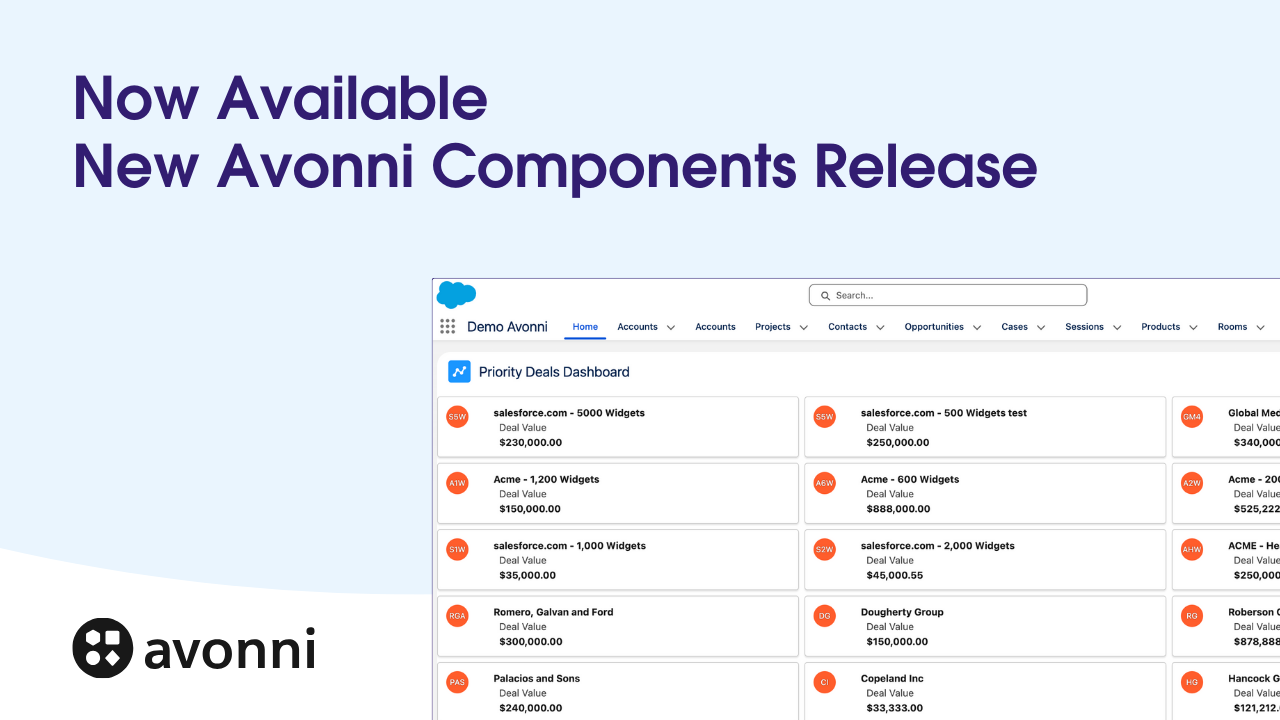
Take Your Salesforce User Experience to the Next Level. Create Salesforce Apps 10x faster. - 70+ Flow Screen Components - 40+ Experience Cloud Components - Free up to 10 users
Avonni Components passed Salesforce's security review and is listed on the AppExchange
Take Your Salesforce User Experience to the Next Level. Create Salesforce Apps 10x faster. - 60+ Flow Screen Components - 30+ Experience Cloud Components - Free up to 10 users
Avonni Components passed Salesforce's security review and is on the AppExchange
Users expect speed, simplicity, and intuitive interactions from their applications. Salesforce is powerful, but there's always room to improve the user experience—especially when navigating pages and accessing information.
The power of showing information where users need it
Imagine a Salesforce where information flows efficiently, interactions are predictable, and users feel in control. A Salesforce where complex processes are streamlined, critical insights surface immediately, and every interaction delivers value.
We can achieve this by embedding contextual information directly into Screen Flow components. This transforms how users interact with your solutions, making them more productive and efficient.
Why contextual information reduces errors and speeds decisions
Users make better decisions faster when they see relevant context. Consider an Account record. In traditional Salesforce, you view the account, then click to related records, then navigate back. Each click is context switching. Each navigation is a moment where the user might lose their original intent.
Contextual information—showing details without navigation—keeps users focused. They make decisions in one place with all necessary information visible. This reduces:
User errors: When all context is visible, users are less likely to make mistakes based on incomplete information.
Decision time: No navigation means no waiting. Users see what they need immediately.
Cognitive load: One interface means one mental model. Users don't have to context-switch between different views.
Research shows that reducing context switches by just 10% improves decision accuracy by 15-20% and reduces task time by 5-10%. That adds up across hundreds of users over months.
Creating more intuitive Salesforce experiences
Instead of burying users with dense pages or modal interruptions, embed relevant details exactly where they're needed. With the Avonni Components package, you move beyond standard Flow Builder limitations and surface information directly in the components users already interact with.
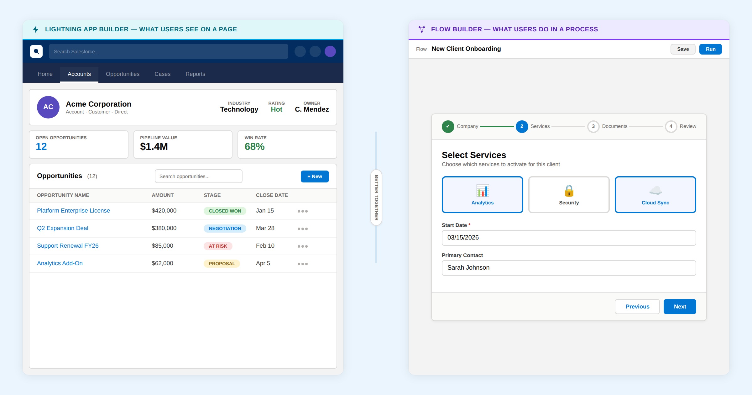
Picture this: an Avonni Calendar within a Screen Flow showing event sessions. Users click a session and instantly see speaker details or full descriptions—no navigation required, no page reload.
Understanding the Open Flow Panel interaction
The "Open Flow Panel" interaction is the key to embedding contextual information. It's different from opening a modal or navigating to a new page. A Flow Panel is a side drawer that slides in from the right (or left, depending on configuration), overlaying the main content without replacing it.
This is powerful because:
Original context stays visible: Users can still see the list, calendar, or table they were working with. The detail panel doesn't cover the entire screen.
Smaller cognitive footprint: A side panel feels less disruptive than a full-screen modal or page navigation.
Easy to close: Users close the panel by clicking the X or clicking outside it. They return to the original view instantly.
Multiple panels can stack: If a detail panel has its own drill-down (e.g., click an employee to see their details), you can open a second nested panel.
Step-by-step: configuring Open Flow Panel
Here's how to set it up:
Create two flows. The parent flow shows the list/calendar/table. The child flow shows the detail view.
In the parent flow, select the component (e.g., the Calendar). This is the component users will interact with.
Add an interaction. Click the component's properties and find "Interactions" or "On Click" settings. Create a new interaction.
Choose "Open Flow Panel." Not "Open Modal" or "Open Dialog"—"Open Flow Panel" specifically.
Select the child flow. This is the detail flow that will appear in the panel.
Map the record ID. Pass the selected record's ID to the child flow. When a user clicks an event in the calendar, capture that event's ID and pass it to the detail flow.
Set panel size. Configure whether the panel should be narrow (30% of screen width) or wider (50%). Narrow panels are good for supplementary details. Wider panels work for complex detail views with multiple sections.
Handle the response. When the user closes the detail panel, the parent flow can refresh its data (e.g., reload the calendar if the user made changes).
The configuration happens entirely in Flow Builder. No custom code needed.
Embedding contextual information: practical example
Here's the technical breakdown:
Two flows work better than one: You'll need two Screen Flows. The first displays the calendar (using Avonni Calendar). The second contains the detailed view you want to show in the side panel.
Connect them: In the primary Flow, configure an "Open Flow Panel" interaction on the Avonni Calendar component. This fires when a user selects an event.
Pass the record ID: Transfer the selected event's record ID to the second Flow. This ensures the detail panel displays the correct information.
Building the detail view
The second Screen Flow renders when users select an event. It's more than a simple panel—it's a rich, layered information experience.
Here's the structure:
Structure with purpose: Combine Avonni components—Headers, Metrics, Tabs—to establish clear information hierarchy and guide users through the data.
Layer the details: Add record details and lists within each tab, providing comprehensive views of the selected event.
Dynamic visibility: Implement conditional rendering to optimize the display and avoid cognitive overload. For example, the Avonni Avatar component only displays when the "Overview" tab is active.
This approach surfaces rich information in a structured, scannable format, maintaining a clean user experience and keeping focus on what matters.
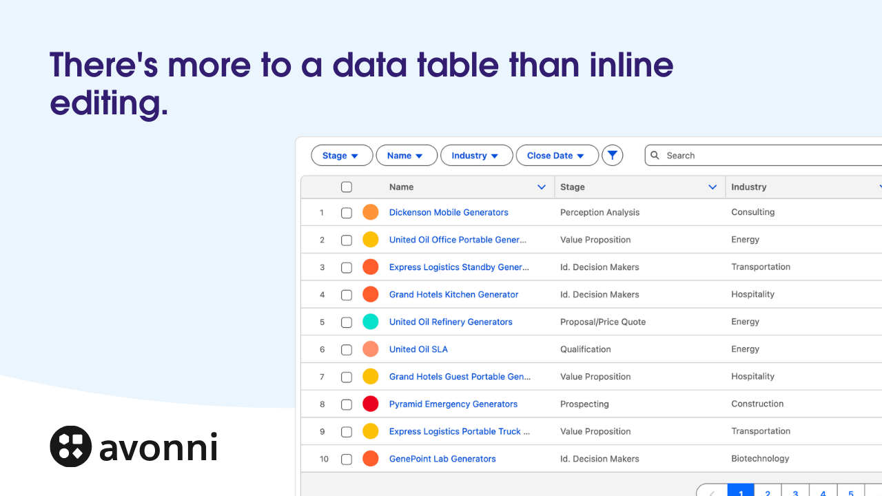
The data table plus detail panel pattern
One of the most useful applications of Flow Panels is the Data Table + Detail pattern. Here's why it works so well:
You have an Avonni Data Table showing accounts. Each row is an account. Users scan the table to find the account they want, then click to see full details. The detail flow opens in a side panel, showing all account information—contacts, opportunities, billing history, etc.
This pattern is better than traditional Salesforce account navigation because:
Bulk scanning: Users stay on the data table and scan rows easily. In traditional Salesforce, you'd click one account, read details, go back, click another. Friction multiplies.
Side-by-side comparison: Keep the table visible while viewing details. If you need to compare two accounts, open one, scan the table, click the second. Both are visible simultaneously.
Consistent interaction model: Every row follows the same interaction: click row, see details, close panel. Users learn the pattern once and apply it everywhere.
For example: an HR admin managing employees. An Avonni Data Table shows all employees in a department: Name, Email, Title, Status. Click an employee, and a detail panel opens showing: full contact info, org chart position, documents, direct reports, performance ratings. All in a structured, tabbed view. Close the panel and return to the table to click another employee.
Keeping detail panels performant
Detail panels can become slow if you load too much data. Here are performance best practices:
Avoid heavy queries
When a user opens a detail panel, your child flow executes. If that flow queries 1,000 records just to display 5, it's slow. Instead:
Query only what you need. If displaying an employee's documents, query only documents for that employee, not all documents in the org.
Use filter conditions. Pass the record ID to the flow and filter queries by that ID. Salesforce will use indexes and return results faster.
Limit result sets. If a list of related records is long, show only the first 10, with a "View All" link. This keeps the initial load fast.
Limit components in the panel
Each component you add to a detail flow consumes resources. A panel with 20 components loads slower than one with 5. Prioritize the most important information. Secondary details can be hidden behind tabs or collapsible sections.
Defer heavy loading
If a detail panel has multiple tabs, load data for the active tab immediately, but defer loading for other tabs until the user clicks them. This makes the panel feel faster.
Choosing between panels, modals, and inline expansion
Salesforce gives you three ways to show detail information. Each is right for different situations:
Flow Panels
Use when: You need to show detailed information while keeping the original context visible. The user might need to reference the list while viewing details. Examples: account/employee detail, event details with list visible.
Avoid when: The detail view is entirely separate from the original context or requires the user's full focus.
Modals (Open Dialog)
Use when: You need the user's attention on a specific task. Examples: confirm a delete action, enter a search query, complete a form that requires focus.
Avoid when: Users need to see the underlying data while making decisions in the modal.
Inline expansion
Use when: Details fit in the available space and the interaction is simple. Examples: expanding a row to show additional columns, revealing a section of hidden fields.
Avoid when: Details are complex or numerous. Inline expansion can make pages too long and difficult to navigate.
Expanding possibilities: contextual information beyond the calendar
The calendar example is just the starting point. With Avonni's component library and the Open Flow Panel interaction, you can reimagine how users interact with data across your org.
Consider these scenarios:
Enhanced account pages: A data table of related employees. Click any employee to open a detail panel with full information—no page navigation.
Interactive maps: Use Avonni Map to display account locations. Click a marker to reveal a panel with account details, contacts, and opportunities—all in the same view.
With the Avonni Open Flow Panel interaction, you break free from traditional Salesforce UX constraints. Build modern, app-like experiences that integrate information and actions directly into the components users already work with. Your users become more productive, make faster decisions, and feel like they're using a purpose-built tool, not a generic platform.


%20(Vignette%20YouTube)%20(81).png)
%20(Vignette%20YouTube)%20(78).png)
%20(Vignette%20YouTube)%20(79).png)
%20(Vignette%20YouTube)%20(11).png)
%20(Vignette%20YouTube)%20(10).png)