Take Your Salesforce User Experience to the Next Level. Create Salesforce Apps 10x faster. - 70+ Flow Screen Components - 40+ Experience Cloud Components - Free up to 10 users
Avonni Components passed Salesforce's security review and is listed on the AppExchange
Take Your Salesforce User Experience to the Next Level. Create Salesforce Apps 10x faster. - 60+ Flow Screen Components - 30+ Experience Cloud Components - Free up to 10 users
Avonni Components passed Salesforce's security review and is on the AppExchange
In today's world, data plays a crucial role in every aspect of our lives. It's essential to have an efficient and organized system to manage and present data...
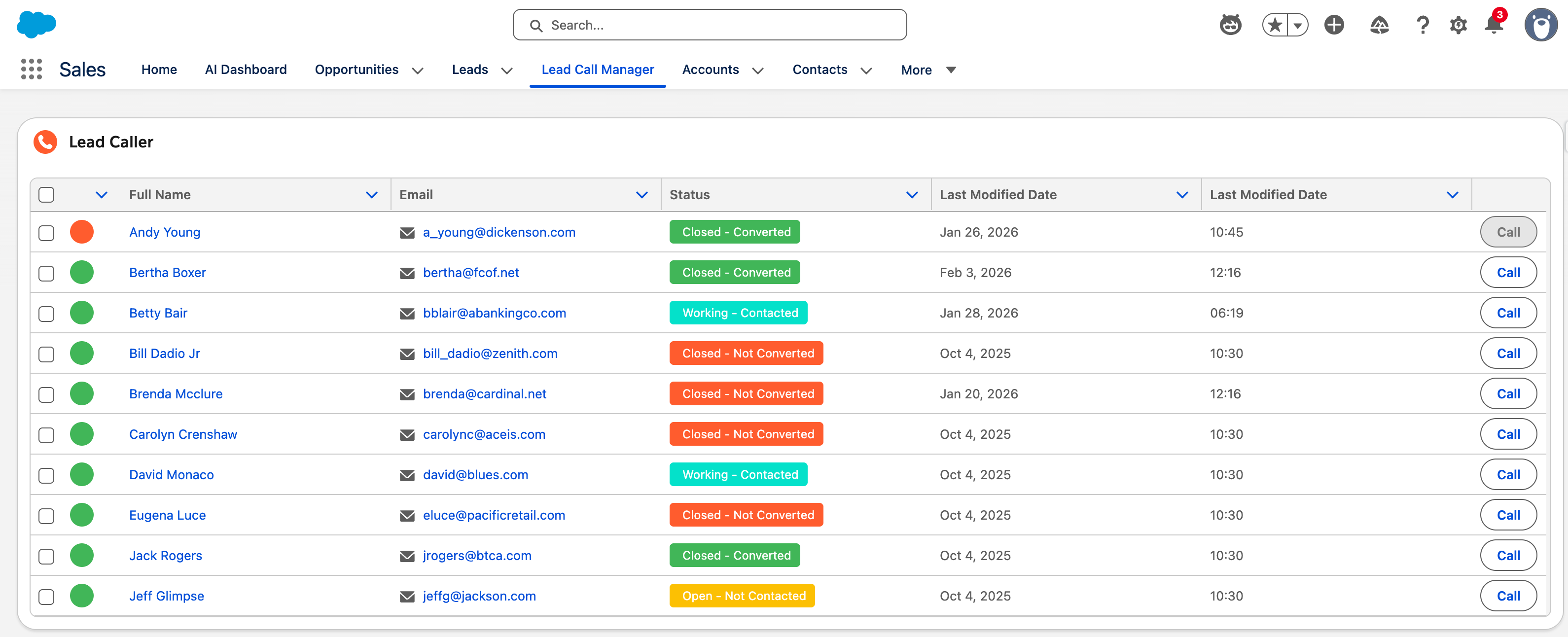
Why Salesforce Admins Need a Better Data Table in Screen Flows
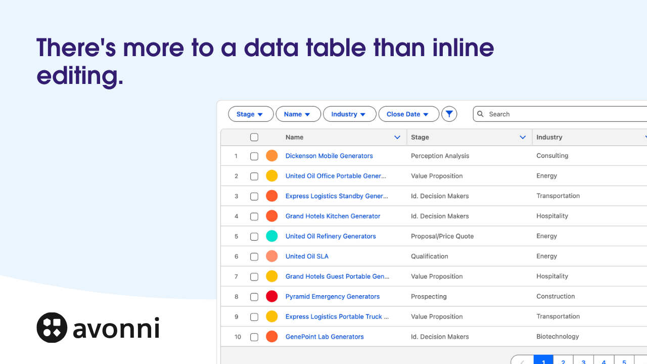
If you've ever built a Salesforce Screen Flow that involves users editing records, selecting items from a list, or stepping through a multi-screen wizard, you've probably hit the same wall: the standard data table just doesn't cut it.
Salesforce's built-in data table for Screen Flows is limited. No search or filtering. No bulk actions. No way to format columns as badges, progress bars, or QR codes. For anything beyond the most basic "pick a record" scenario, admins end up writing Apex, building custom Lightning Web Components, or stitching together workarounds that are fragile and time-consuming to maintain.
The Avonni Data Table is a Flow Screen Component that solves this. It gives Salesforce admins a fully interactive, no-code data table purpose-built for Screen Flows — where users need to capture data, edit records inline, navigate multi-step wizards, and take action on the information in front of them.
What Is the Avonni Data Table?
The Avonni Data Table is an enhanced Salesforce Flow Screen Component that replaces the standard data table inside your Screen Flows. It's designed for scenarios where your flow needs users to interact with data — not just look at it.
Think of it as a supercharged spreadsheet embedded directly in your flow screens, with built-in support for inline editing, bulk updates, filtering, searching, grouping, pagination, row actions, and 25+ column display types — all configurable through a visual drag-and-drop builder. No code required.
When to Use the Avonni Data Table (Flow Screen Component)
The Avonni Data Table for Screen Flows is ideal for:
Data capture and entry forms — Let users fill in or update multiple records directly inside a flow screen, then save everything in one step.
Bulk editing workflows — Select a batch of opportunities, contacts, or cases and mass-update fields like stage, owner, or status in a single action.
Multi-step wizards — Guide users through a sequence of screens where they review, select, edit, and confirm data at each step.
Record selection with context — Present a rich, searchable, filterable table so users can make informed selections (e.g., choosing products for a quote, assigning tasks, or picking contacts for a campaign).
Approval and review processes — Display records for review with inline editing capabilities, row-level actions, and save interactions.
Advanced related lists inside flows — Build custom related list views with actions, filters, and editing embedded in a guided flow experience.
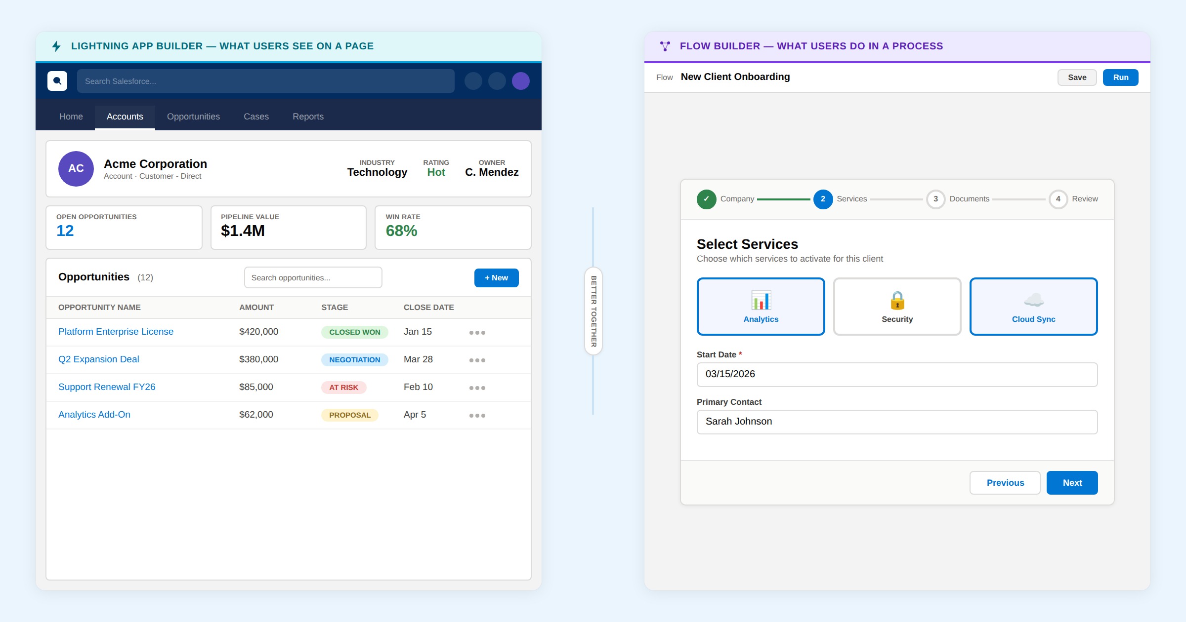
A Note on Displaying Data on Lightning Pages
Picking the Right Data Table: Flow vs. Page
Don't embed a screen flow on a page just to display a data table — use the tool built for each context.
Screen Flows
Avonni Data Table Flow Component
Use when:
Your use case lives inside a flow — data entry, wizards, bulk edits, guided processes.
Data captureBulk editWizardsApprovals
Lightning Pages
Avonni Dynamic Components
Use when:
Your use case lives on a page — record pages, app pages, home pages. No flow needed, better performance.
Data displayDashboardsRelated lists100+ components
How the Avonni Data Table Compares to the Standard Salesforce Data Table
Here's what sets the Avonni Data Table apart from the standard Salesforce data table component available in Screen Flows:
Feature
Standard Salesforce
Avonni Data Table
Inline editing
~Text fields only
✓All field types supported
Bulk editing
✕
✓
Built-in search
✕
✓Including hidden field search
Column filtering
✕
✓Horizontal, popover, or side panel
Group By
✕
✓Custom ordering & collapsible sections
Pagination
✕
✓Configurable items per page
Row actions
✕
✓Dropdown menus with custom actions
Header actions
✕
✓Bulk edit, export, custom flows
25+ column types
✕
✓Badge, progress bar, QR code, avatar, rating, toggle & more
Conditional cell coloring
✕
✓
Data export
✕
✓CSV and Excel
Query Data Source
✕
✓No Get Records needed
Lookup fields
✕
✓
Pill container
✕
✓
Drag-and-drop builder
✕
✓
Reactive queries
✕
✓
Rich text display
✕
✓
Custom styling
✕
✓Row height, borders, colors
Key Features in Detail
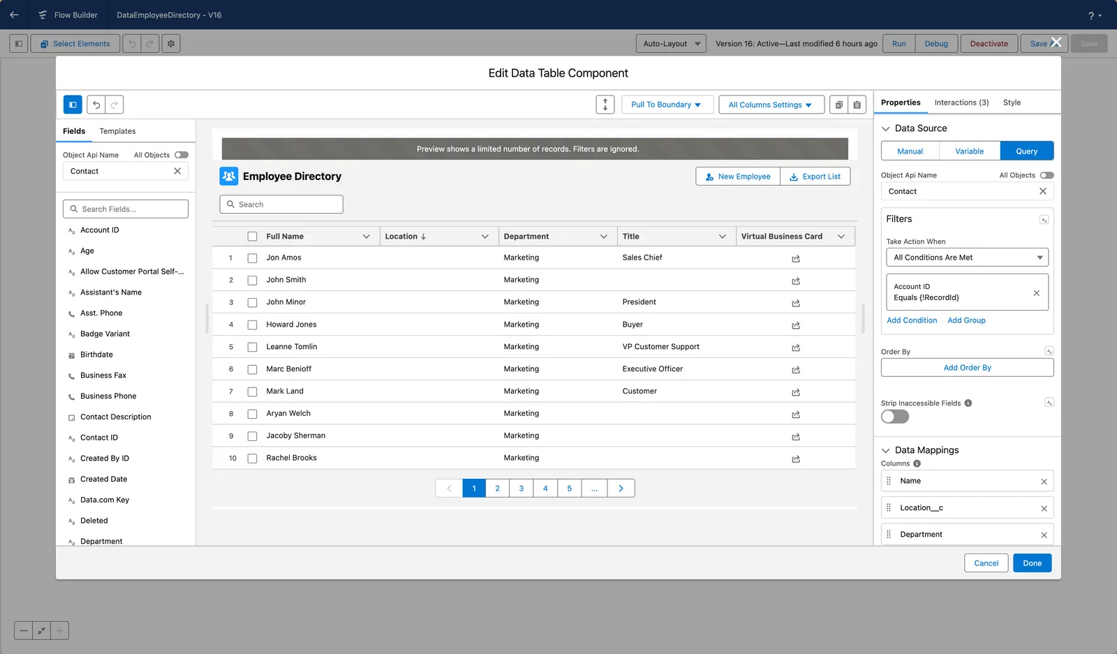
1. Visual Component Builder — No Code Configuration
Every aspect of the Avonni Data Table is configured through an integrated visual builder, directly inside the Salesforce Flow Builder. No JSON, no Apex, no LWC code.
The builder gives you:
Drag-and-drop column mapping — Drag fields from your data source onto the canvas to create columns instantly.
Real-time preview — See exactly how your table will look as you configure column properties, filters, styling, and interactions.
Template gallery — Start from pre-built data table templates designed for common use cases.
All-columns settings — Apply settings like "editable," "filterable," or "display as input" to every column at once.
Copy/paste configurations — Duplicate your data table setup to another screen in the same flow.
2. Three Flexible Data Sources
The Avonni Data Table supports three ways to connect to your Salesforce data:
Query Data Source — Write SOQL-like queries directly inside the component using a visual query builder. This is the most powerful option: it eliminates the need for separate "Get Records" elements, supports filtering, ordering, and lookup field traversal, and keeps your flow canvas cleaner. Ideal for dynamic, real-time data retrieval.
Variable Data Source — Connect the table to a collection variable (typically the output of a "Get Records" element). Useful when your flow already retrieves data upstream or when you need to manipulate records before displaying them.
Manual Data Source — Define static or predefined data directly. Useful for lookup tables, reference lists, or configuration-driven interfaces.
3. Inline Editing and Data Capture
This is where the Avonni Data Table really shines in Screen Flows. Two editing modes are available:
Inline editing (pencil icon) — A pencil icon appears next to editable fields. Users click to enter edit mode. Best for occasional edits where you want to clearly indicate which fields are modifiable.
Direct cell editing (Display as Input) — Fields render as input boxes by default, so users can type directly without any extra clicks. Perfect for data entry forms, bulk editing screens, and wizard steps where speed matters.
Both modes support a save interaction that persists changes back to Salesforce — using the built-in Update Records action or custom flow logic you define.
The Avonni Data Table supports inline editing for most standard and custom objects. The full list of supported objects follows Salesforce's UI API supported objects. Note that lookup fields are currently read-only in inline editing mode.
4. 25+ Column Display Types
Go far beyond plain text. Each column can be configured to display data as any of these types:
Standard types: Text, Number, Currency, Percent, Date, Date Local, Email, Phone, URL, Location, Boolean, Rich Text
Visual types: Badge, Progress Bar, Progress Circle, Progress Ring, QR Code, Rating, Avatar, Color Picker, Slider, Toggle
This means you can build tables where a "Status" column renders as a color-coded badge, "Completion" shows as a progress bar, "Priority" displays as a star rating, and "Approve" is a clickable toggle — all without writing code.
5. Search, Filter, and Group Your Data
The Avonni Data Table includes three powerful ways for users to find and organize information:
Search — A built-in search box that queries across any fields you designate as searchable. You can even make non-visible fields searchable, so users can find records based on data that isn't displayed as a column. Supports default search values for pre-filtered views.
Filtering — Configure any column as filterable using three layout options:
Horizontal filters — Displayed above the table in a row
Popover filters — Hidden behind icons, appearing as floating panels when clicked
Side panel filters — A collapsible panel on the left or right side of the table
Dynamic picklist filters automatically show only values that exist in the current dataset, keeping filter menus clean and relevant. You can even filter on hidden columns — useful for refining data without cluttering the table display.
Group By — Organize rows into collapsible sections based on any column value. Customize the group ordering (ascending, descending, or custom), show row counts per group, linkify lookup values for quick navigation, and control whether groups start expanded or collapsed.
6. Row Actions and Header Actions
Row actions add a dropdown menu to each row, giving users quick access to operations like "Edit," "Delete," "View Details," or any custom action you define. These actions are wired to flow interactions — they can open sub-flows, navigate to records, update data, or trigger any logic you configure.
Header actions place buttons at the top of the table for operations that apply to the table as a whole — like "New Record," "Bulk Edit," "Export to CSV," or "Refresh Data." These are especially powerful when combined with the row selection checkbox, letting users select multiple records and then act on them via a header button.
7. Bulk Editing Workflows
One of the most impactful use cases for the Avonni Data Table in Screen Flows is bulk editing. The typical pattern works like this:
A main flow displays records in a Data Table with checkboxes enabled.
Users select the records they want to update.
A "Bulk Edit" header button triggers a sub-flow dialog.
The sub-flow opens a second Data Table — pre-filtered to only the selected records — with all fields set to "Display as Input."
Users edit the fields they need, click Save, and the sub-flow updates all records at once.
The main flow refreshes to show the updated data.
This entire workflow is built declaratively with no code — just two flows and two Data Table components wired together through interactions.
8. Pagination and Infinite Scrolling
For large datasets, the Avonni Data Table supports both pagination and infinite scrolling:
Pagination — Configure items per page, button alignment, and navigation controls. Users move between pages with clear visual indicators.
Infinite scrolling — Activate full-height mode and the table loads additional records as users scroll down, creating a seamless browsing experience.
9. Pill Container for Selections
When row selection is enabled, selected records can be displayed in a pill container above the table. Each pill shows a label (configurable to any field), can be removed with a click, and can be sorted or displayed in a single line. This gives users clear visibility into their current selection — particularly useful in wizard-style flows where selections carry forward to the next step.
10. Data Export
The Avonni Data Table includes a built-in export interaction that lets users download the table contents as CSV or Excel. This can be triggered via a header action button, giving users a self-service way to extract data without admin intervention.
When using the Query Data Source, the Avonni Data Table supports reactive queries — meaning the table automatically refreshes when upstream flow variables change. This is the foundation for building interactive, multi-component flow screens where selecting a value in one component instantly updates the data displayed in another.
Combined with Text Templates (which simplify dynamic SOQL filter construction), reactive queries make it straightforward to build master-detail screens, cascading filters, and other patterns that would normally require custom code.
12. Lookup Relationship Fields
The Query Data Source lets you traverse lookup relationships and display fields from related objects. For example, on an Opportunity table, you can display the Account Name, Account Type, or any other field from the parent Account — directly as a column. These lookup fields render as clickable links that navigate to the related record.
Step 1: Install the Avonni Flow Screen Components Package
The Avonni Flow Screen Components package is available on the Salesforce AppExchange and has passed Salesforce's security review. It's free for up to 10 users.
Step 2: Enable Lightning Web Security
To ensure optimal performance with the Avonni Data Table, make sure Lightning Web Security is enabled in your Salesforce org. This prevents performance issues and supports the smooth operation of the component.
Step 3: Build Your First Data Table
Create or edit a Screen Flow in Salesforce Setup.
Drag the Avonni Data Table component onto a screen element.
Choose your data source (Query is recommended for most use cases).
Drag fields onto the canvas or use "Add Columns" to map your data.
Configure column properties, editing modes, filters, and styling using the visual builder.
Set up interactions for save, row actions, and header actions.
Choosing the Right Avonni Component for Your Use Case
Avonni offers Data Table components across multiple products. Here's how to choose:
Your Use Case
Recommended Product
Data entry, bulk editing, or wizards inside a Screen Flow
This guideAvonni Data Table (Flow Screen Component)Enhanced data table built for interactive, multi-step flow experiences
Displaying data on a Lightning App, Record, or Home Page
Avonni Dynamic ComponentsNative Lightning Page components with real-time reactivity — no flow required
Displaying data on a Lightning Page with simple setup
Avonni App Builder ComponentsStandalone components configured through the standard App Builder property panel
Data tables on an Experience Cloud site
Avonni Experience Site ComponentsOptimized for portal and community use cases
The key distinction: Flow Screen Components are for interactive, multi-step processes. Dynamic Components are for page-level data display and interaction. Choosing the right one ensures the best performance and user experience.
Resources and Next Steps
Full Documentation — Complete reference for every feature, property, and interaction


%20(Vignette%20YouTube)%20(72).png)

.gif)


%20(Vignette%20YouTube)%20(81).png)
%20(Vignette%20YouTube)%20(78).png)
%20(Vignette%20YouTube)%20(79).png)
%20(Vignette%20YouTube)%20(11).png)
%20(Vignette%20YouTube)%20(10).png)