Login

 Get Started
Get Started
Avonni Components Package
Take Your Salesforce User Experience to the Next Level. Create Salesforce Apps 10x faster.
- 70+ Flow Screen Components
- 40+ Experience Cloud Components
- Free up to 10 users
- 70+ Flow Screen Components
- 40+ Experience Cloud Components
- Free up to 10 users
Avonni Components passed Salesforce's security review and is listed on the AppExchange
Install in ProductionInstall in a SandboxAvonni Designer
Prototype your Salesforce Applications in minutes.
- Lightning Applications
- Lightning Pages
- Lightning Web Component
Try for freeLogin- Lightning Applications
- Lightning Pages
- Lightning Web Component
Get Started
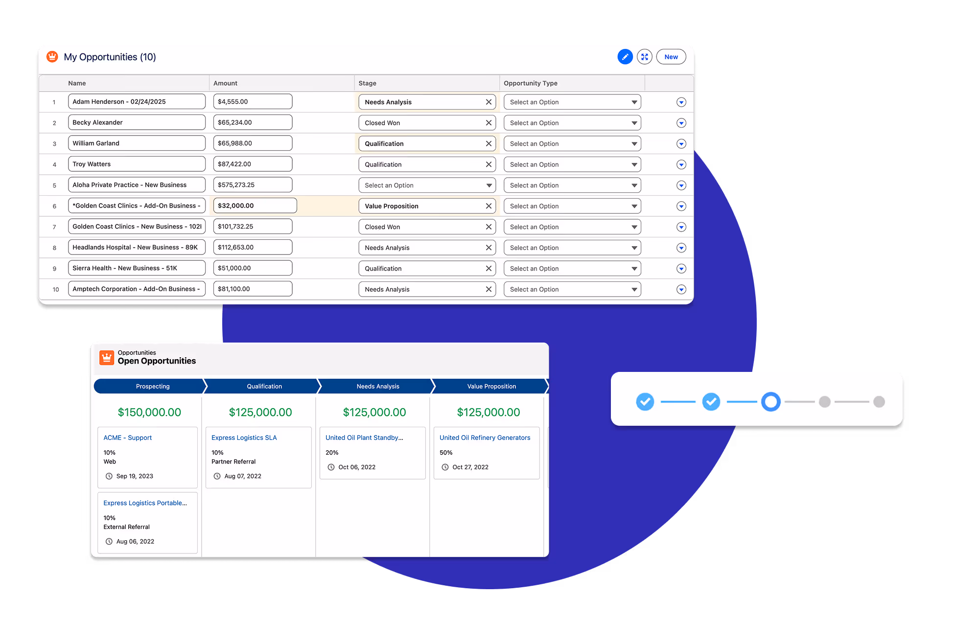
Avonni Components for App & Record Pages
Build powerful, fully customizable Lightning pages and Experience Sites
15+ App Builder Components
85+ Dynamic Components
40+ Experience Sites Components
Passed the Security review
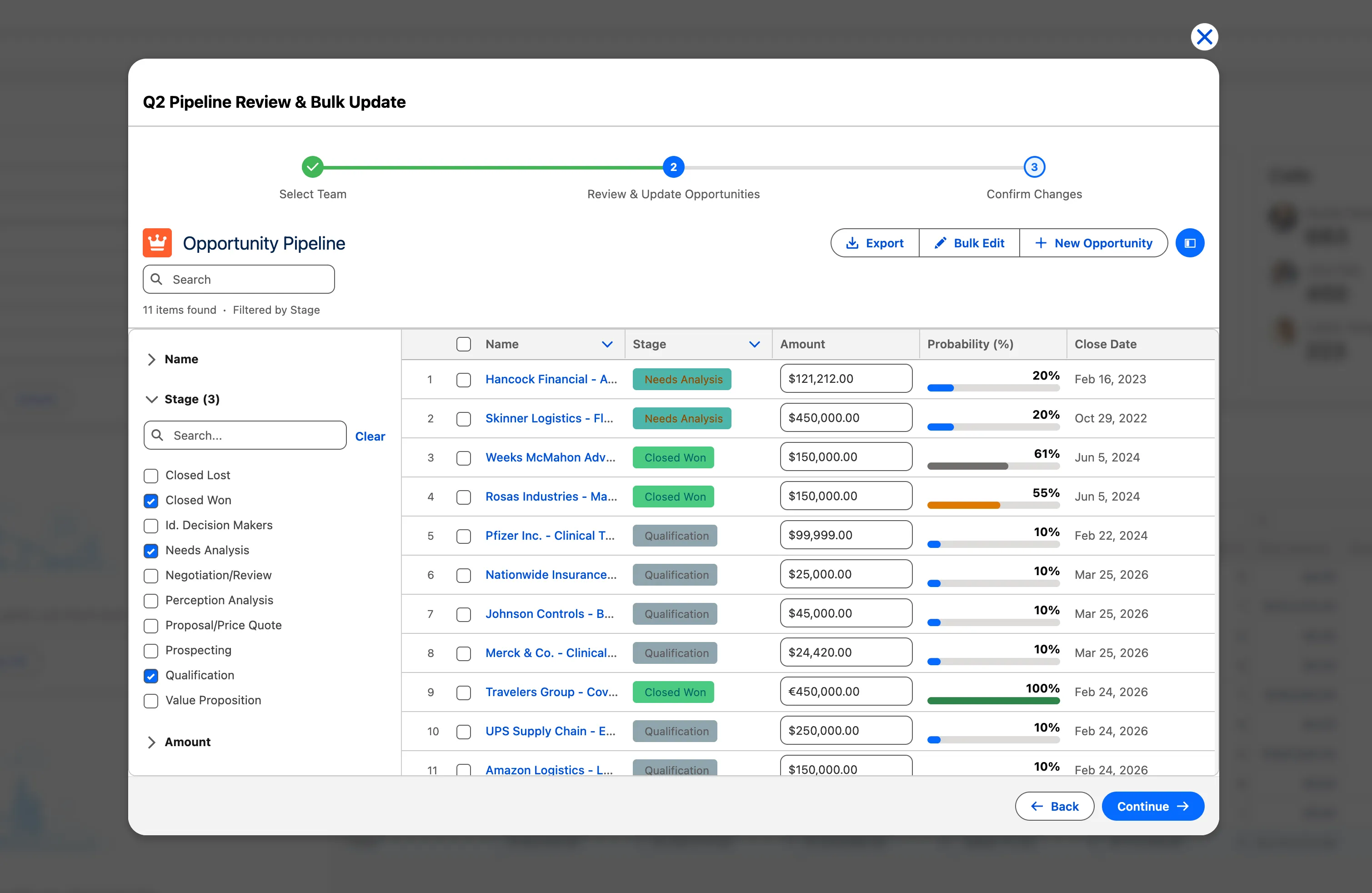
Avonni Components for Flows & Experience Sites
Create multi-step wizards and guided processes with 70+ Screen Flow components
70+ Components for Flows
No-code customization
Passed the Security review
Get Started
Avonni Components package
Take Your Salesforce User Experience to the Next Level. Create Salesforce Apps 10x faster.
- 60+ Flow Screen Components
- 30+ Experience Cloud Components
- Free up to 10 users
- 60+ Flow Screen Components
- 30+ Experience Cloud Components
- Free up to 10 users
Avonni Components passed Salesforce's security review and is on the AppExchange
Install in ProductionInstall in a SandboxGet Started
Avonni Experience Components
Build powerful, fully customizable Lightning pages and Experience Sites
15+ App Builder Components
85+ Dynamic Components
40+ Experience Sites Components
Passed the Security review
Avonni Flow Screen Components
Create multi-step wizards and guided processes with 70+ Screen Flow components
70+ Components for Flows
No-code customization
Passed the Security review
Avonni Designer
Login
Install the Avonni Flow Screen Components on your Salesforce org
Thank you! Your submission has been received!
Oops! Something went wrong while submitting the form.
🔒 Salesforce-certified ISV partner
%20(Vignette%20YouTube)%20(960%20x%20900%20px).webp)
